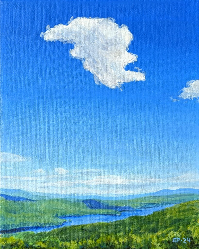
Pinning a Cloud

©2024, Emma Pittson, “Lone Cloud”. Acrylic on canvas, 10″ x 8″ x 0.5″.

Another day, another landscape painting!

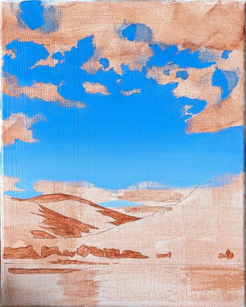
For this one, I decided to tape out the area in the sky where the big cloud was going to be because I knew that it would probably take me a few tries and several layers of paint (spoiler alert: it did!) to get the sky the right colour with the correct amount of fade. The goal wasn’t so much to have the painted cloud match the reference perfectly, but to give the white of the paint the best chance of looking bright and vivid – something that would be much easier to do over blank canvas rather than a saturated blue sky.

The layers of blue paint turned out to be thicker than I had anticipated, so when I peeled off the tape, a sharp edge was left behind in the sky. If you turn the painting to the side, or if the light catches it a certain way, there is obvious “shelf” on the surface of the painting. Woops!

Speaking of colours and fades, I keep coming across artists who work with acrylics and who also manage to make incredibly smooth gradients and shading – and all without airbrushing! I asked a few on Instagram: “WHAT is your secret??” and they always answer the same: “Layers, layers, and more layers!” I must be missing something because whenever I use Glazing medium to create layers, my paint quickly turns into a gunky, sticky mess. But if by “layers”, they mean “Keep painting the same area over and over again so that it’s so opaque that it can block an x-ray”, then I’m happy to say that that is one technique that I’ve definitely mastered!

Over The Hills and Far Away

©2024, Emma Pittson, “The Valley”. Acrylic on canvas, 10″ x 8″ x 0.5″.

I’m still deep in my “mental vacation” and enjoying painting these summer landscapes!

I’m endlessly fascinated by sunlight and shadows on hillsides. Not only do I love it when the skies are partially cloudy, thus creating clear and obvious areas of light and shadow on the ground, but I love it even more when the terrain is hilly and you get to imagine what is just beyond those hills. Makes me want to throw on a backpack and start trekking!

Original reference photo

Unlike the previous landscape paintings, I did not opt for a brightly coloured ground this time around. My intention was for the acrylics to be their best acrylic selves and show off some bold colour, and I felt that fighting against a vivid ground would be overkill. Instead, I started with a light wash of Raw Sienna, and blocked in a few of the darkest areas of the painting.

The next step was painting in the blue of the sky all in one go. With any luck, I wouldn’t have to try to spot-paint any missing or botched areas along the way (because you can NEVER match the colour in a fade perfectly, no matter how hard you try). The clouds and water were then quickly blocked in.

As usual, beyond that, I got lost in endless noodling of the hillsides. I had hoped to keep the trees of the foreground hill fairly loose and undefined, but compared to the finesse of the farthest hill, the foreground hill looked out of place. In the end, I realized that it was best to paint in some individual trees (more or less), and I’m glad I did because that’s what really made that hill jump forward!

Other sneaky Photoshop trick: I was debating for a while if I should make the farthest hill paler. To find out, I uploaded an in-progress image of the painting into Photoshop and used the Magnetic Lasso tool to select only the farthest hill, and then adjusted the Brightness on it. As you can see, that little preview convinced me that paler was better!

Variation on a theme

The best thing about doing multiple versions of a piece is that you can try different methods and approaches with each iteration. I’ve been working up the gumption to explore non-realistic colour, and I thought that a tiny work on paper was the best place to start. Boy, was I in for a surprise! It turns out that imaginative colour is a LOT harder for me to wrap my mind around than I’d bargained for. I aimed for a flat, cell-shaded look, but in the end, I couldn’t resist putting in all kinds of detail in the face.

To be honest, I’m a bit disappointed in myself because the “Lucy in the Sky with Diamonds” sequence from the Beatles’ “Yellow Submarine” movie is something that my 4 year-old brain latched onto as a Life-Altering-Work-Of-Art, and it’s an aesthetic that I want to incorporate into my current work. I honestly thought that mimicking that look in my own art would be a cinch, but alas, it looks like I’ve got a ways to go before I unlock my inner Heinz Edelmann. Let us consider this a First Draft, and as Neil Gaiman says: “Your first draft doesn’t count”. All it has to do is exist.

©2022, Emma Pittson, “Not Stripes”. Acrylic and oil on paper, 5″ x 5″.

Messy Bun

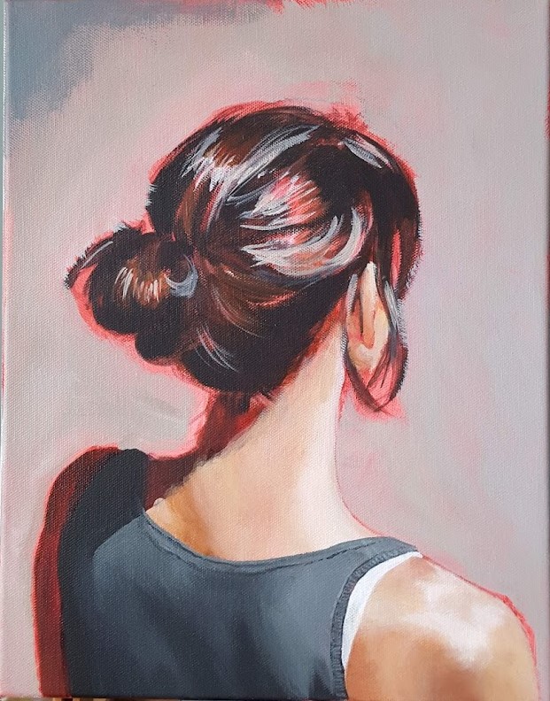
©2022, Emma Pittson, “Messy Bun”. Oil and acrylic on canvas, 14″ x 11″ x 0.5″

Here is another contender for the title of “Painting That Has Sat For The Longest Amount Of Time On My Easel While I Contemplate How Best To Approach It”. I believe it clocked in at about one full year. While I’m not completely sure why I lost my courage for so long, I suspect that I hesitated partly because I worried that the whole “portrait of the back of a woman’s head” thing had already been done to death. To me, it seemed like a cheap and easy way to add some mystery to an otherwise very pedestrian image. But artists steal ideas from each other all the time, and when you get right down to it, how many of us can say that our work is 100% original? We are all influenced by each other, and if you’re waiting for a truly original idea before putting paint to canvas, you’ll be waiting a long, long time. Life’s too short!

Original Reference Photo

I also wavered quite a bit on what medium to use. Acrylics are odor-free but difficult to blend, while oils (even water-miscible oils!) give me a headache. In the end, most of the painting is acrylic, with only the hair and certain details on the clothing are oils.

This piece also went through a few digital iterations prior to – and even during – the painting process. You might remember this earlier post where I played around with various background colours on a first pass of digital painting.

The winning background colour!

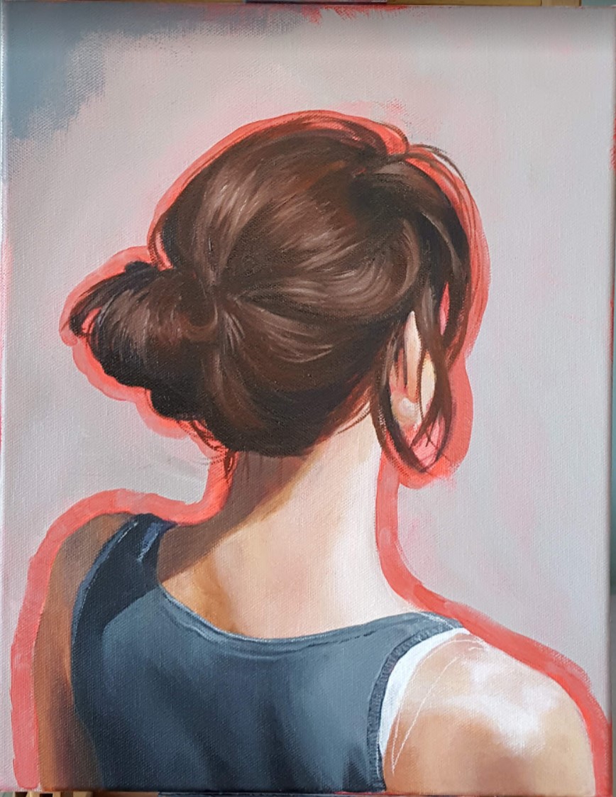
Once I’d decided on the background colour, I put down a first layer of acrylics then painted a second digital pass on top – just to reassure myself that I was going in the right direction after all.

And finally, here are some more process shots as I moved from acrylics to oils.

And now this painting sits on my piano – which I also haven’t touched in forever, btw – where I can see it every day, and it fills me with a sense of enormous well-being, and also a healthy dose of “Took you long enough!”

Re-Visiting My First Painting

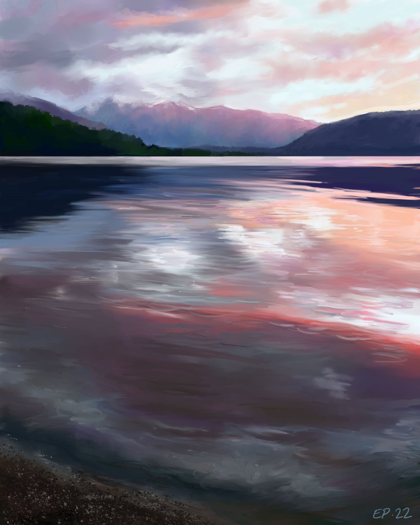
©2022, Emma Pittson, “Lake Wanaka in Blue II”. Photoshop.

After my self-portrait, I had a little spate of bad luck art-wise. While January was a really productive month, February has been one failed art experiment after another. I’m also trying to pep-talk myself back into picking up an actual paint brush and committing to a decent-sized canvas, but it’s slow-going for now. I’ve had this digital re-paint of my very first acrylic paint from 2016 on the back-burner for a few months now, and because it’s good for morale to actually FINISH things, this seemed like the perfect time to wrap it up.

When I look back on the original painting, I’m struck by how every single brush stroke looks nervous and hesitant. I had internalized so much negativity from my time at art school that it’s a miracle I’d managed to paint anything at all. I may not be as productive, nor as consistent, as I’d like to be, but I’m proud of how far I’ve come since this first painting.

Lake Wanaka sunset in blue new Zealand
©2016, Emma Pittson, “Lake Wanaka in Blue”. Acrylic on panel, 10″ x 8″.