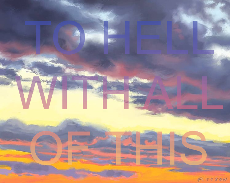
Number 2 of 7 landscape paintings re-contextualized with text (as set out and explained in this previous post). I’m thinking of printing this one on a mug!
Number 2 of 7 landscape paintings re-contextualized with text (as set out and explained in this previous post). I’m thinking of printing this one on a mug!

They say that when you’re feeling stressed, going for a walk is one of the simplest and best things you can do for your mental health. The trouble is: despite my best efforts, I can never totally forget why I’m out in nature in the first place. And worse yet: I know that the moment I get back into the office, the circus will start up all over again. That’s Life, right?
I’ve also been thinking about how women are under added pressure to disguise their negative emotions in an office environment. Ok, if I’m completely honest, I am ALWAYS thinking about how women are perceived in an office environment (what can I say? I work in a male-dominated industry). How many of us have spoken up for or against something at work and then immediately wondered if we sounded “nice” or “non-confrontational” enough? That’s a lot of emotional care-taking of others in an already stressful situation!
And suddenly, I just wanted to be totally honest: at this moment, I am very stressed, and no amount of greenery will solve my problems. So this week-end, I took some of my landscape paintings and slapped ambivalent or downright negative text right on top of them. As I said last time, even though I’m proud of these paintings, I also find them kind of boring and not representative of me as an artist. I’m not saying that I’ve arrived at my creative destination – it’s just that I feel like I can’t make room for the artist I want to become until I clear out some clutter, if that makes sense. To do that, I had to take these sacred cows and make them a lot less precious.
I’ve added text to about 7 images in all, and I cannot believe how “alive” they look to me now! Whereas before they were just sleepy landscapes, now there is a palpable tension between the peaceful scenery and the jarring, in-your-face negativity of the text. Warning: for some of them, the language I use is pretty adult. I’ll post those next time, and they will be visible under the cut only.
This is by far the most “conceptual” I’ve ever been in my art, and a real departure for me. I have to admit that I had great fun doing it! Globally, I feel that this is more of a “circuit-breaker” and a safe, cheeky way to vent rather than a new direction, but you never know, right? Only time will tell…


Ever get the feeling you’re overthinking a project?
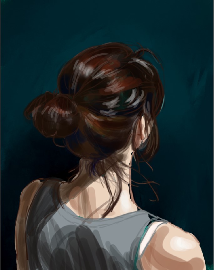
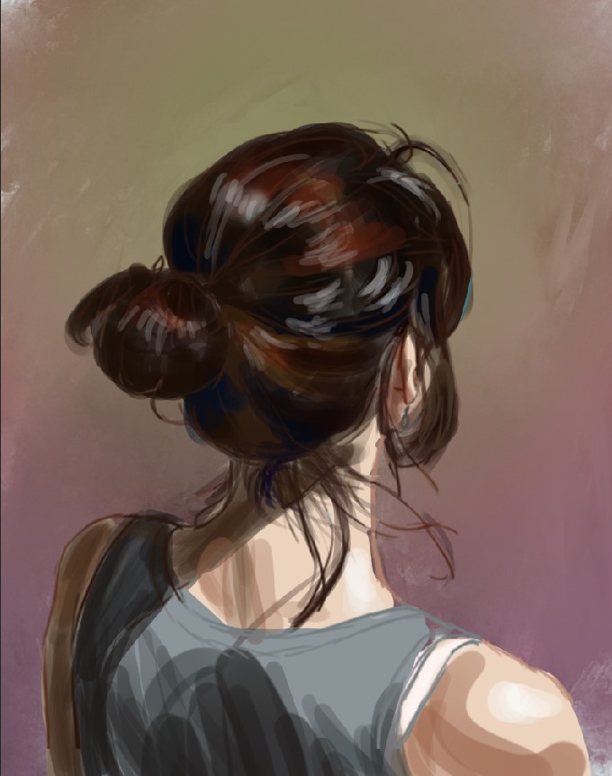
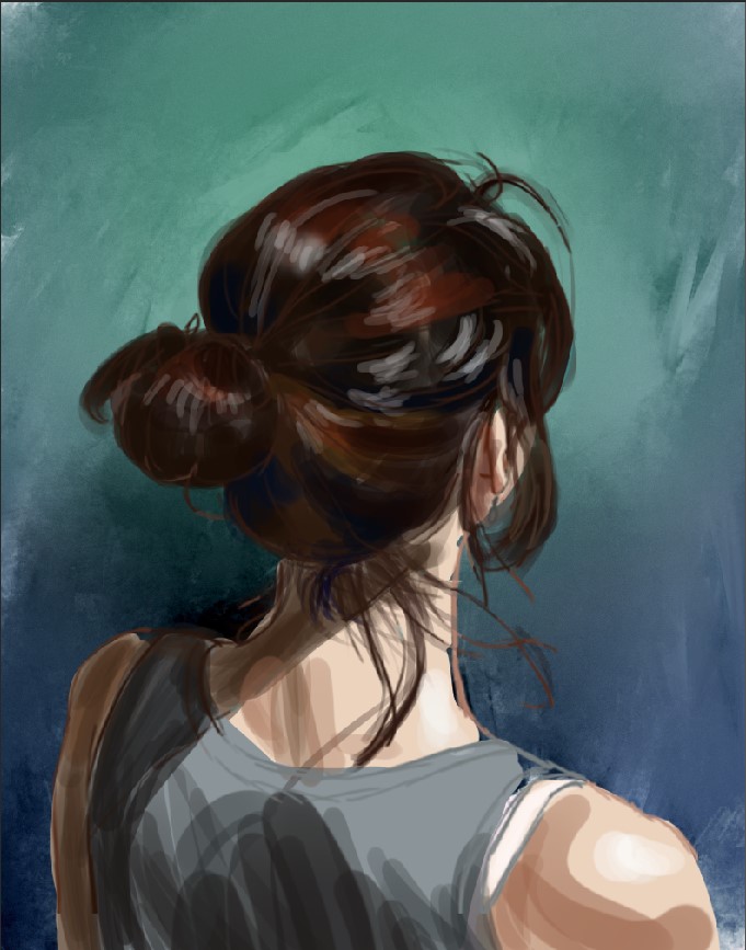
I know exactly how I want to paint the figure, and then I thought “Hang on. I tend to treat the background as an afterthought, but this time, I really want to be sure I choose the RIGHT colour scheme”. So I cracked open Photoshop, and next thing I know, I have too many variations to choose from.
My husband likes #6, but for me, it’s a toss-up between #4 and #8. At least… I think? 😉

Just FYI, I am ALL about post-mortems, and I’ve been itching to do this since I started this whole venture! So without further ado, here are my observations from my first time participating in the “30 in 30” challenge…
Greatest benefit: Instead of only talking about painting and building up a body of work, I actually DID it! And, bonus! I learned that I could actually handle the paint pretty well. Well, most of the time…
Biggest letdown: A sense of… I don’t know if I’d call it boredom, but rather the nagging feeling that I should have been devoting my energy to making original art and not just studies. You can see that by the end of the challenge, I started to waffle and take more time with my paintings. This was less because I had become a fussbudget, and more because I frequently contemplated abandoning them altogether. I’m still not sure if I took on this challenge just as a way of putting off the more difficult task of coming up with original imagery.
The Mediums are the Message: I tried more than a few on my acrylic paintings over the last few weeks, but I’ll save that breakdown for a future post. In the meantime, I’ll leave you with this: they are NOT created equal.
(F)oil paints: They took me for a ride, no question! Remember Poe Dameron in Star Wars: The Force Awakens, when he first flies the Tie-Fighter (“WHOA! This thing really MOVES!”)? Well, that was me with oils. It was a bit of a bumpy ride at first, but I’m proud of myself for giving them a go and getting to know them a little better – one more tool at my disposal!
Painting mistakes I made all the way through:
Things I’d like to try with my painting from here on in:
Saving the best for last: The engagement with other artists who were crazy enough to do the “30 in 30” challenge, and their support, has been one of the best takeaways from this experience – bar none! It was a welcome opportunity to connect with fellow artists, learn from each other, and see some great art. You can bet I’ll be back when the next challenge rolls around!
(More or less) One-line summaries of each painting:

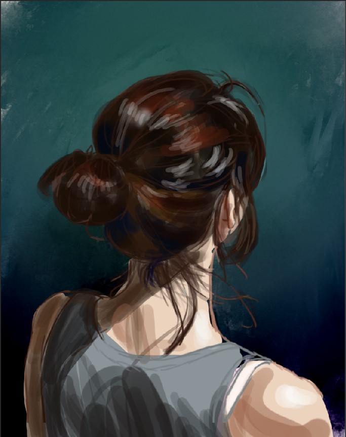
I have… mixed feeling about this one.
First of all, you really should see it live and in person. Trust me – the colours of her hair have a nice depth, and her skin tones are far more delicate than what you see here. For some reason, WordPress just makes this one seem garish.
But wonky colours aside, I’m not sure about proceeding this way. I can look at this painting and know exactly where I stitched stuff together (and I will always see that!), and don’t get me started on how long it took to find all the right elements! Even when I got the right shoulder and head pose (and the hair!), it didn’t always follow that the shadows matched. In fact, finding all the reference images ended up taking much longer than the actual painting!
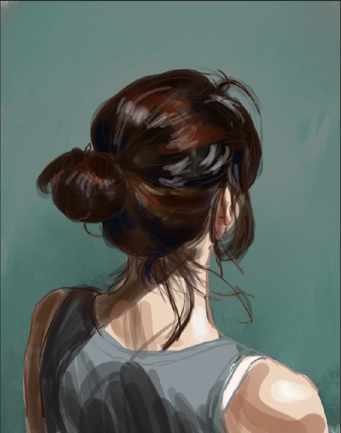
What I like about this painting:
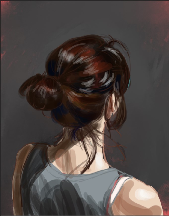
What I like less about the painting:
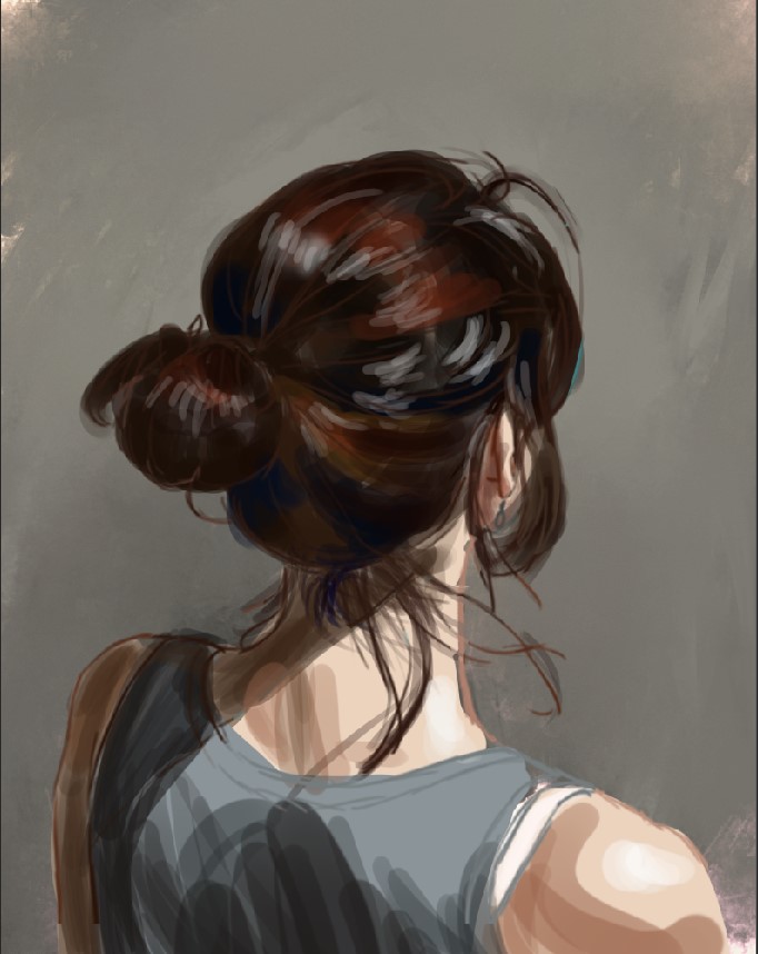
What I learned through this process:
What I MIGHT change…
