Third Time’s the Charm

©2024, Emma Pittson, “Night Sky”. Oil on paper, 8″ x 10″.

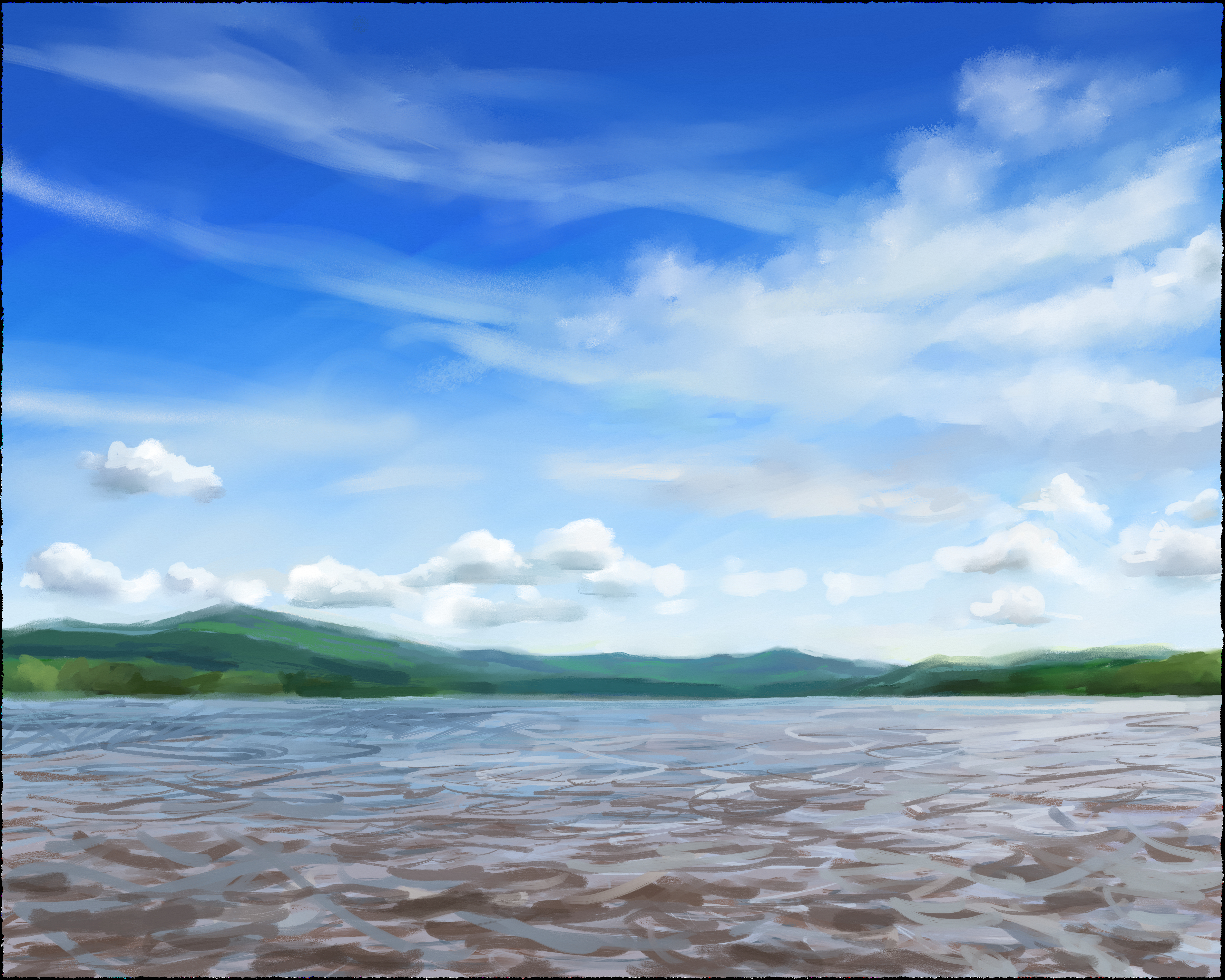
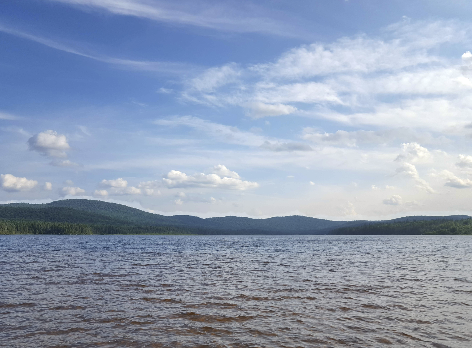
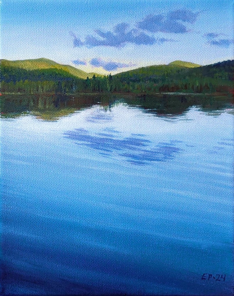
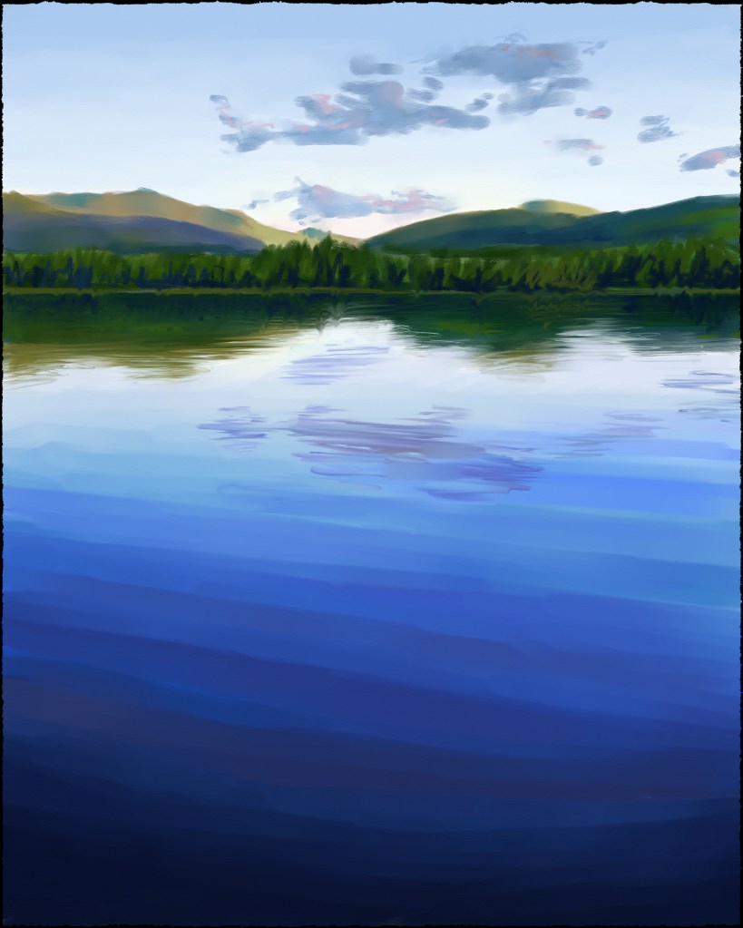
Such a simple image: lots of blue, lots of black, and a tiny spattering of gold. This SHOULD have been one of my easiest paintings to paint, right?

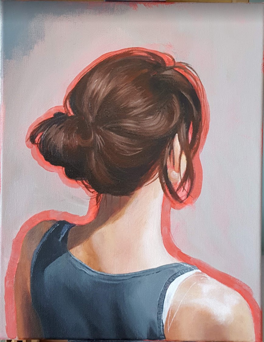
WRONG. Maybe it was the tricky combination of Cobalt Blue, Ultramarine Blue, and Mars Black that added unexpected drying time to my treasured water-miscible oil paint… maybe it was the choice of substrate that guaranteed my frustration (canvas – too rough, even with a few extra coats of gesso; YUPO paper, so smooth that the paint lifted right off; and finally Canson Oil & Acrylic paper, too buckle-y)… but most likely, it was the fact that, as usual, I mixed and applied too little paint at a time, and that meant that I had to work and re-work certain areas over and over again. There needs to be a support group for cheapskate painters like myself (“Hi, my name is Emma, and I consistently mix too little paint and then I have the gall to wonder why my brush isn’t gliding smoothly across the surface, and the whole process takes much, MUCH longer than it should. Will I never learn??”).

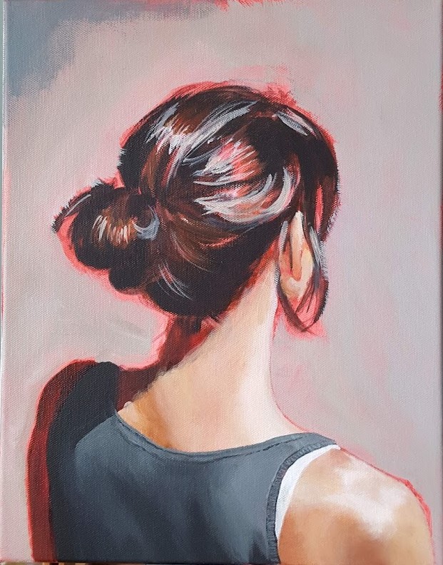
Anyways, after all that heartache, I am pleased with the final result! I’ll have to make some repairs to the right side of the painting to make up for what the tape lifted off accidentally, but otherwise, this might be one of my favourites. I just never want to see it again! 😉

My own little “Salon des Refusés“! From left to right: acrylic on Canson paper, oil on canvas, acrylic on YUPO paper

Lac des Sables – Take 2

©2024, Emma Pittson, “Lac des Sables”. Oil on canvas, 8″ x 10″ x 0.5″

This is actually the first landscape painting that I started a few weeks ago, but I panicked at the idea of painting all those ripples in the water, so I ended up finishing the Sunset painting earlier.

I have no clear motivation behind these landscape paintings other than treating them as opportunities to get back into painting again. I’ve spent far too long “cheating” with digital painting, and it’s a bit of a shock to realize that perceiving and mixing the correct colour is much harder than I remember.

On to the next!

Lac des Sables at sunset

©2024, Emma Pittson, “Lac des Sables at Sunset”. Oil on canvas, 10″ x 8″ x 0.5″.

I’ll say one good thing about being unemployed: plenty of time for painting!

And because I’d love nothing better than to ignore my current woes and dream of happier days to come, I’m manifesting my future summer vacation by painting where exactly I’d like to be right about now (okay, well, maybe not right NOW now, because it is February, after all).

I can also assure you from personal experience that Holbein’s Duo Aqua oil paint (in Ultramarine Blue, no less!) CAN clean up, fully and completely, from your carpet. 

Variation on a theme

The best thing about doing multiple versions of a piece is that you can try different methods and approaches with each iteration. I’ve been working up the gumption to explore non-realistic colour, and I thought that a tiny work on paper was the best place to start. Boy, was I in for a surprise! It turns out that imaginative colour is a LOT harder for me to wrap my mind around than I’d bargained for. I aimed for a flat, cell-shaded look, but in the end, I couldn’t resist putting in all kinds of detail in the face.

To be honest, I’m a bit disappointed in myself because the “Lucy in the Sky with Diamonds” sequence from the Beatles’ “Yellow Submarine” movie is something that my 4 year-old brain latched onto as a Life-Altering-Work-Of-Art, and it’s an aesthetic that I want to incorporate into my current work. I honestly thought that mimicking that look in my own art would be a cinch, but alas, it looks like I’ve got a ways to go before I unlock my inner Heinz Edelmann. Let us consider this a First Draft, and as Neil Gaiman says: “Your first draft doesn’t count”. All it has to do is exist.

©2022, Emma Pittson, “Not Stripes”. Acrylic and oil on paper, 5″ x 5″.

Messy Bun

©2022, Emma Pittson, “Messy Bun”. Oil and acrylic on canvas, 14″ x 11″ x 0.5″

Here is another contender for the title of “Painting That Has Sat For The Longest Amount Of Time On My Easel While I Contemplate How Best To Approach It”. I believe it clocked in at about one full year. While I’m not completely sure why I lost my courage for so long, I suspect that I hesitated partly because I worried that the whole “portrait of the back of a woman’s head” thing had already been done to death. To me, it seemed like a cheap and easy way to add some mystery to an otherwise very pedestrian image. But artists steal ideas from each other all the time, and when you get right down to it, how many of us can say that our work is 100% original? We are all influenced by each other, and if you’re waiting for a truly original idea before putting paint to canvas, you’ll be waiting a long, long time. Life’s too short!

Original Reference Photo

I also wavered quite a bit on what medium to use. Acrylics are odor-free but difficult to blend, while oils (even water-miscible oils!) give me a headache. In the end, most of the painting is acrylic, with only the hair and certain details on the clothing are oils.

This piece also went through a few digital iterations prior to – and even during – the painting process. You might remember this earlier post where I played around with various background colours on a first pass of digital painting.

The winning background colour!

Once I’d decided on the background colour, I put down a first layer of acrylics then painted a second digital pass on top – just to reassure myself that I was going in the right direction after all.

And finally, here are some more process shots as I moved from acrylics to oils.

And now this painting sits on my piano – which I also haven’t touched in forever, btw – where I can see it every day, and it fills me with a sense of enormous well-being, and also a healthy dose of “Took you long enough!”