Arriving just in time for the holidays, I received my very own copy of ”Artist Mother Proud & Serious – Vol.1″, and oh, hey! Look who’s on page 124!!
Technically, this happened at the end of 2023, but I’m posting it today because I intend to use the good vibes from this incredible opportunity as a strong launch pad for 2024. And of course, all my thanks to AMPS’s Editor-in-Chief, Mona Lerch, for her undying faith in me, and her passion and dedication for putting this all together!
Happy New Year, everyone! Wishing you all the best for 2024! 🎉
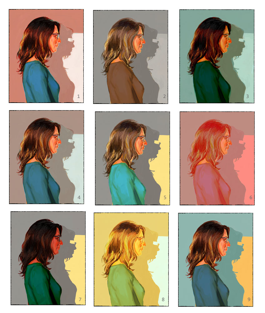
Believe me, if I had produced any kind of finished artwork at all, I would have shared it here. But other than spending an inordinate amount of time tinkering with endless colour variations for a new painting that was never completed (see image below), and that one raspberry-coloured self-portrait, 2023’s art output was a bit of a bust.
There are many reasons why the art never really manifested itself, but most of it can be boiled down to two reasons: work and depression. By late 2022, all of my closest friends at the office had moved on to bigger and better things, and I was left with a serious case of “feeling left behind” and lonely, and that really sapped my creativity. What kept me going was the carrot that had been dangled over me for some months: a much longed-for promotion, which I eventually got in the Spring.
And then my job just took over my life! Things were made worse by the fact that the Writers’ and Actors’ strikes had wiped out any employment possibilities for quite a few people in the FX and Animation industry (including my husband), so any job I had, no matter how stressful, was one that I was grateful for and intended to hang onto for dear life.
Also, to be perfectly honest, the self-portraits happened out of necessity, but at this point, I think I may have said everything I needed to say with them. What that New Direction is, I’m still not sure, but it might be something completely different from anything I’ve done before. Stay tuned…!
And to be perfectly honest, this one was a real wake-up call. I realized – too late! – that I’d become too reliant on digital painting. Sure, digital painting is an art form in itself and requires its own skill set, but at the end of the day, it is not Real Paint. Real paint comes in only a set amount of colours. Real paint doesn’t have an “Undo” button. And like it or not, most people want to see an actual thing that exists out there in the world, a unique, one-of-a-kind object that has the mark of the artist’s hands all over it (metaphorically speaking).
Or maybe they don’t really care and it’s just my own insecurities talking. I have a lot of those. When I’m feeling up for it, I can ramble on about my doubts about water-miscible oils vs. REAL oil paints, and then we can watch the fur REALLY fly!
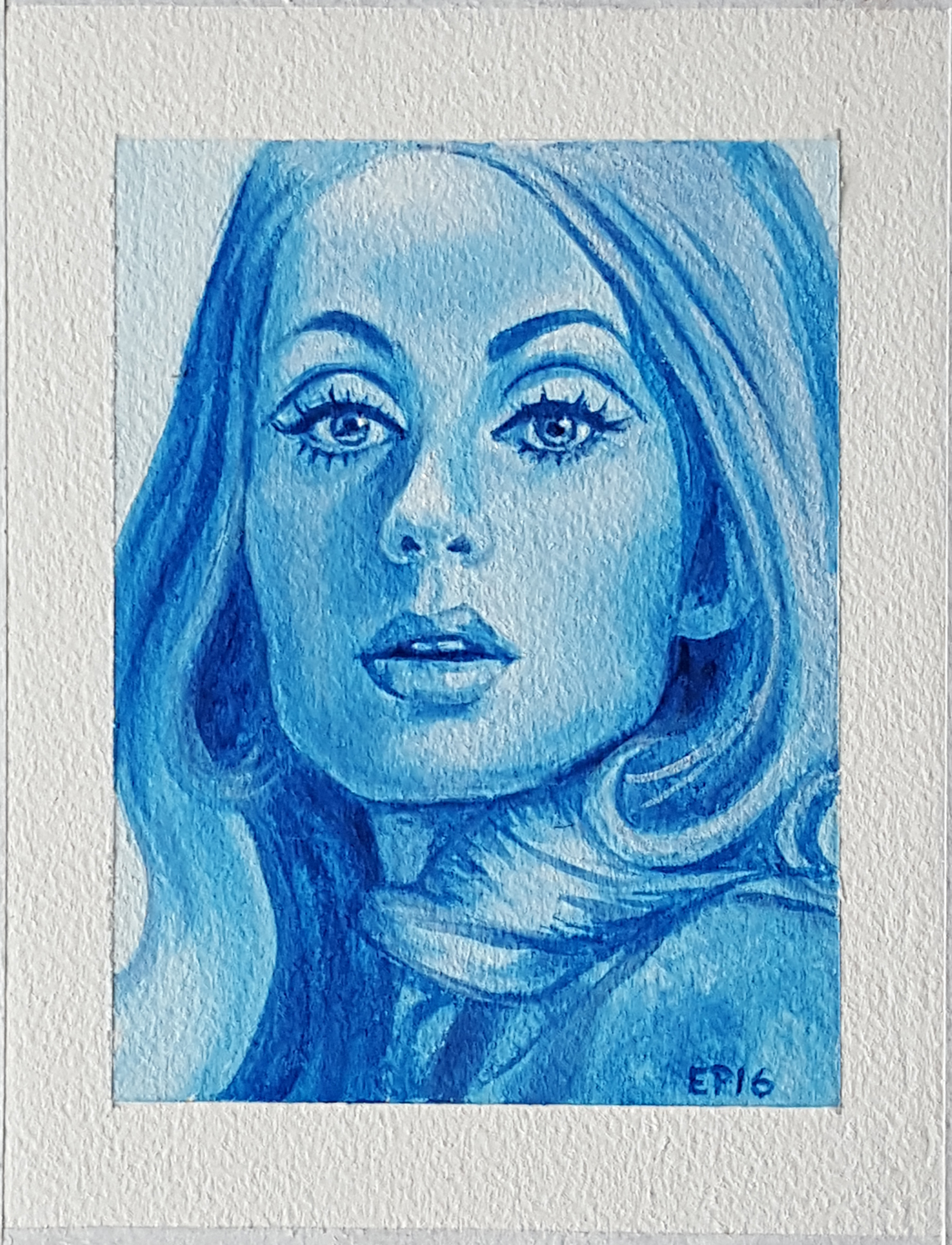
Anyways, I felt compelled to put some paint to canvas, and let me assure you that diving back into traditional art-making was a painful experience. My first painting was larger with a full selection of colours, but it had to be temporarily set aside because I realized that I had bitten off more than I could chew. This smaller, monochromatic self-portrait is actually my “rebound” painting. Still, whenever I lost control of my brush, I did, in fact, automatically move my hand in the general direction of the “Undo” button like I was still sitting in front of my keyboard (busted!).
I will say this about WMOs: just because you can mix them with water doesn’t necessarily mean that you should. Looking at this painting now, it’s obvious that I treat oil paints like glorified acrylics, and the results and not always the best. In fact, if I compare this painting to a much earlier acrylic piece (below, left), I think that the acrylic is far more successful in that the brush strokes are smoother and more confident. My signature, I’m happy to say, remains as blockish as ever. 😉
The best thing about doing multiple versions of a piece is that you can try different methods and approaches with each iteration. I’ve been working up the gumption to explore non-realistic colour, and I thought that a tiny work on paper was the best place to start. Boy, was I in for a surprise! It turns out that imaginative colour is a LOT harder for me to wrap my mind around than I’d bargained for. I aimed for a flat, cell-shaded look, but in the end, I couldn’t resist putting in all kinds of detail in the face.
To be honest, I’m a bit disappointed in myself because the “Lucy in the Sky with Diamonds” sequence from the Beatles’ “Yellow Submarine” movie is something that my 4 year-old brain latched onto as a Life-Altering-Work-Of-Art, and it’s an aesthetic that I want to incorporate into my current work. I honestly thought that mimicking that look in my own art would be a cinch, but alas, it looks like I’ve got a ways to go before I unlock my inner Heinz Edelmann. Let us consider this a First Draft, and as Neil Gaiman says: “Your first draft doesn’t count”. All it has to do is exist.
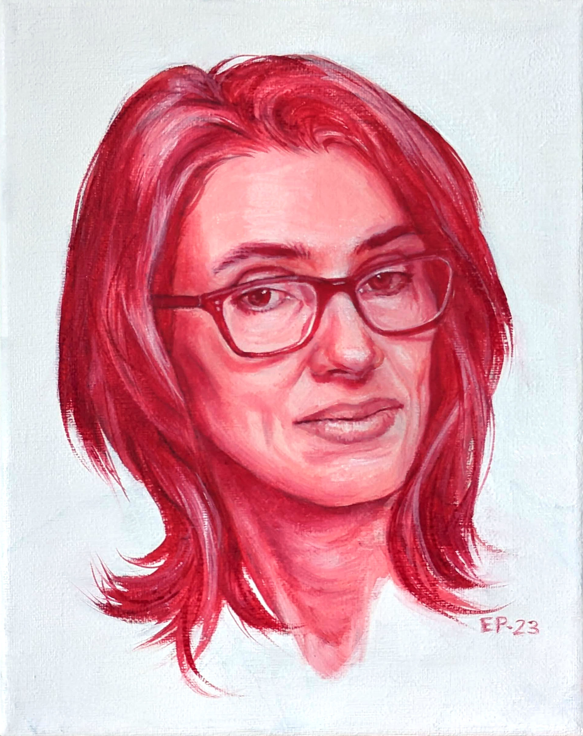
For this piece, I decided to keep things simple and low-concept: just a roughly painted self-portrait, using a reference photo taken with my computer camera (note the tell-tale glowing blue neck). I kept the brushwork loose, and even cheated a little by sometimes relying on the eye dropper tool to help me get the right colour. There have to be some advantages to working digitally, right?
This piece was also an opportunity to better understand the newest addition to my digital painting arsenal: Escape Motion’s Rebelle 5. It’s early days still, but this might turn out to be one of my favourite softwares. Photoshop will always reign supreme for the sheer number of tools at one’s disposal, but Rebelle 5 has a much better “surface texture” feeling. Many digital painting programs claim that they can mimic the sensation of pushing paint around, but this one comes closest of all, in my opinion. And if nothing else, how can you not like the ripped edges of the canvas? Talk about a perfect little detail that I never knew I wanted!