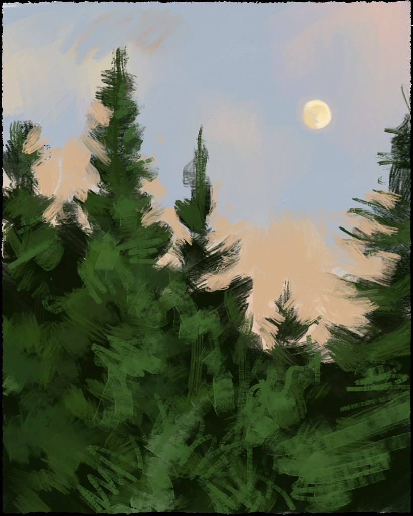
After a few anxious months, careening between optimism and despair, I am thrilled to announce that I have officially rejoined the ranks of the employed!! Maybe I should re-title this painting “Happy Little Trees” because that’s how grateful l am, especially when you consider the state of the animation/vfx industry as it stands currently.
I’m also happy to report that this painting came along rather easily compared to the previous painting of a wooded scene. In fact, it went so well, I just might be more inclined to paint even more of them!
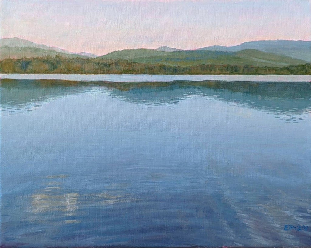
Being furloughed, I have more “quiet time” than is strictly necessary, but at least it gives me a chance to get some painting done! On the easel this time, yet another dreamy landscape (and yes, it’s Lac des Sables up at Mont Tremblant National Park, again – I got a whole theme going, and am thinking of asking for contracts with the Laurentians Tourism bureau at this point). 😉
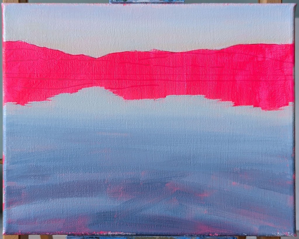
I started with a brilliant pink background because I thought that any pink showing through would look nice and fit the mood of the painting. Also, I just needed cheering up!
I was about 3/4 of the way through before I realized that the line of trees at the edge of the water could afford to be paled down in order to enhance the sense of space. I also felt that the general colour of the water needed some tweaking. After that, there was no more avoiding the ripples in the foreground – a favourite, as always (she said, gritting her teeth)!
The line of trees is too dark and it shortens the space. Still to do: the ripples!
It might interest you to know that there was an earlier version of this same painting, but I had started it with an orange background instead.
My husband liked the painting in its early stages so much that he convinced me to leave it as is. This rough, half-painted version now has a permanent home in his office!
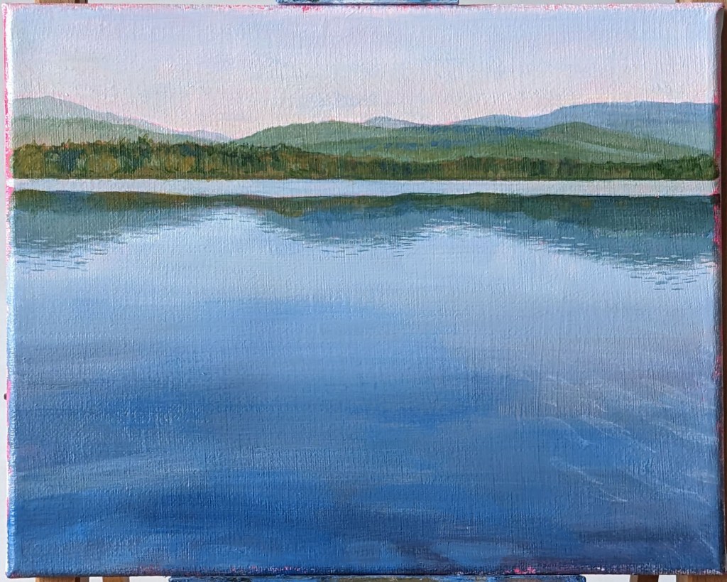
So… do we like this version better? Is this how I should be painting ALL of my landscapes from this point onwards?
Such a simple image: lots of blue, lots of black, and a tiny spattering of gold. This SHOULD have been one of my easiest paintings to paint, right?
WRONG. Maybe it was the tricky combination of Cobalt Blue, Ultramarine Blue, and Mars Black that added unexpected drying time to my treasured water-miscible oil paint… maybe it was the choice of substrate that guaranteed my frustration (canvas – too rough, even with a few extra coats of gesso; YUPO paper, so smooth that the paint lifted right off; and finally Canson Oil & Acrylic paper, too buckle-y)… but most likely, it was the fact that, as usual, I mixed and applied too little paint at a time, and that meant that I had to work and re-work certain areas over and over again. There needs to be a support group for cheapskate painters like myself (“Hi, my name is Emma, and I consistently mix too little paint and then I have the gall to wonder why my brush isn’t gliding smoothly across the surface, and the whole process takes much, MUCH longer than it should. Will I never learn??”).
Anyways, after all that heartache, I am pleased with the final result! I’ll have to make some repairs to the right side of the painting to make up for what the tape lifted off accidentally, but otherwise, this might be one of my favourites. I just never want to see it again! 😉
My own little “Salon des Refusés“! From left to right: acrylic on Canson paper, oil on canvas, acrylic on YUPO paper
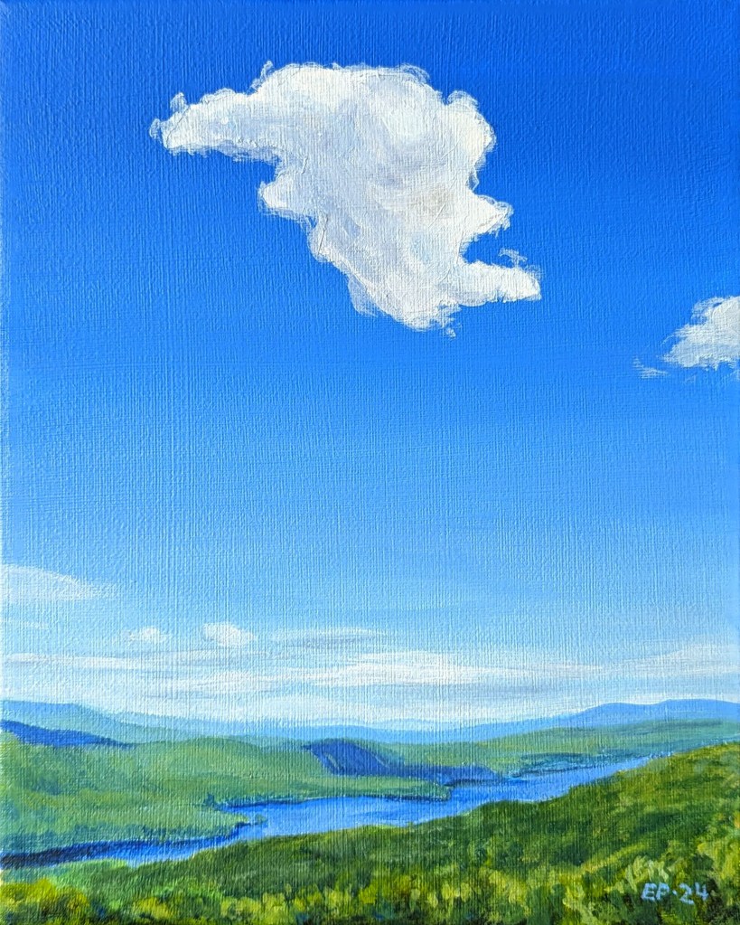
For this one, I decided to tape out the area in the sky where the big cloud was going to be because I knew that it would probably take me a few tries and several layers of paint (spoiler alert: it did!) to get the sky the right colour with the correct amount of fade. The goal wasn’t so much to have the painted cloud match the reference perfectly, but to give the white of the paint the best chance of looking bright and vivid – something that would be much easier to do over blank canvas rather than a saturated blue sky.
The layers of blue paint turned out to be thicker than I had anticipated, so when I peeled off the tape, a sharp edge was left behind in the sky. If you turn the painting to the side, or if the light catches it a certain way, there is obvious “shelf” on the surface of the painting. Woops!
Speaking of colours and fades, I keep coming across artists who work with acrylics and who also manage to make incredibly smooth gradients and shading – and all without airbrushing! I asked a few on Instagram: “WHAT is your secret??” and they always answer the same: “Layers, layers, and more layers!” I must be missing something because whenever I use Glazing medium to create layers, my paint quickly turns into a gunky, sticky mess. But if by “layers”, they mean “Keep painting the same area over and over again so that it’s so opaque that it can block an x-ray”, then I’m happy to say that that is one technique that I’ve definitely mastered!
I’m still deep in my “mental vacation” and enjoying painting these summer landscapes!
I’m endlessly fascinated by sunlight and shadows on hillsides. Not only do I love it when the skies are partially cloudy, thus creating clear and obvious areas of light and shadow on the ground, but I love it even more when the terrain is hilly and you get to imagine what is just beyond those hills. Makes me want to throw on a backpack and start trekking!
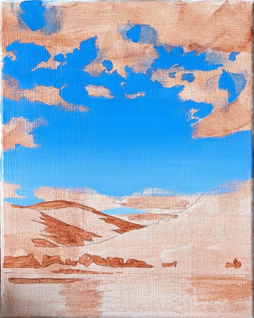
Original reference photo
Unlike the previous landscape paintings, I did not opt for a brightly coloured ground this time around. My intention was for the acrylics to be their best acrylic selves and show off some bold colour, and I felt that fighting against a vivid ground would be overkill. Instead, I started with a light wash of Raw Sienna, and blocked in a few of the darkest areas of the painting.
The next step was painting in the blue of the sky all in one go. With any luck, I wouldn’t have to try to spot-paint any missing or botched areas along the way (because you can NEVER match the colour in a fade perfectly, no matter how hard you try). The clouds and water were then quickly blocked in.
As usual, beyond that, I got lost in endless noodling of the hillsides. I had hoped to keep the trees of the foreground hill fairly loose and undefined, but compared to the finesse of the farthest hill, the foreground hill looked out of place. In the end, I realized that it was best to paint in some individual trees (more or less), and I’m glad I did because that’s what really made that hill jump forward!
Other sneaky Photoshop trick: I was debating for a while if I should make the farthest hill paler. To find out, I uploaded an in-progress image of the painting into Photoshop and used the Magnetic Lasso tool to select only the farthest hill, and then adjusted the Brightness on it. As you can see, that little preview convinced me that paler was better!