After a few anxious months, careening between optimism and despair, I am thrilled to announce that I have officially rejoined the ranks of the employed!! Maybe I should re-title this painting “Happy Little Trees” because that’s how grateful l am, especially when you consider the state of the animation/vfx industry as it stands currently.
I’m also happy to report that this painting came along rather easily compared to the previous painting of a wooded scene. In fact, it went so well, I just might be more inclined to paint even more of them!
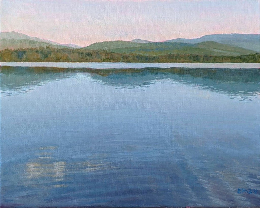
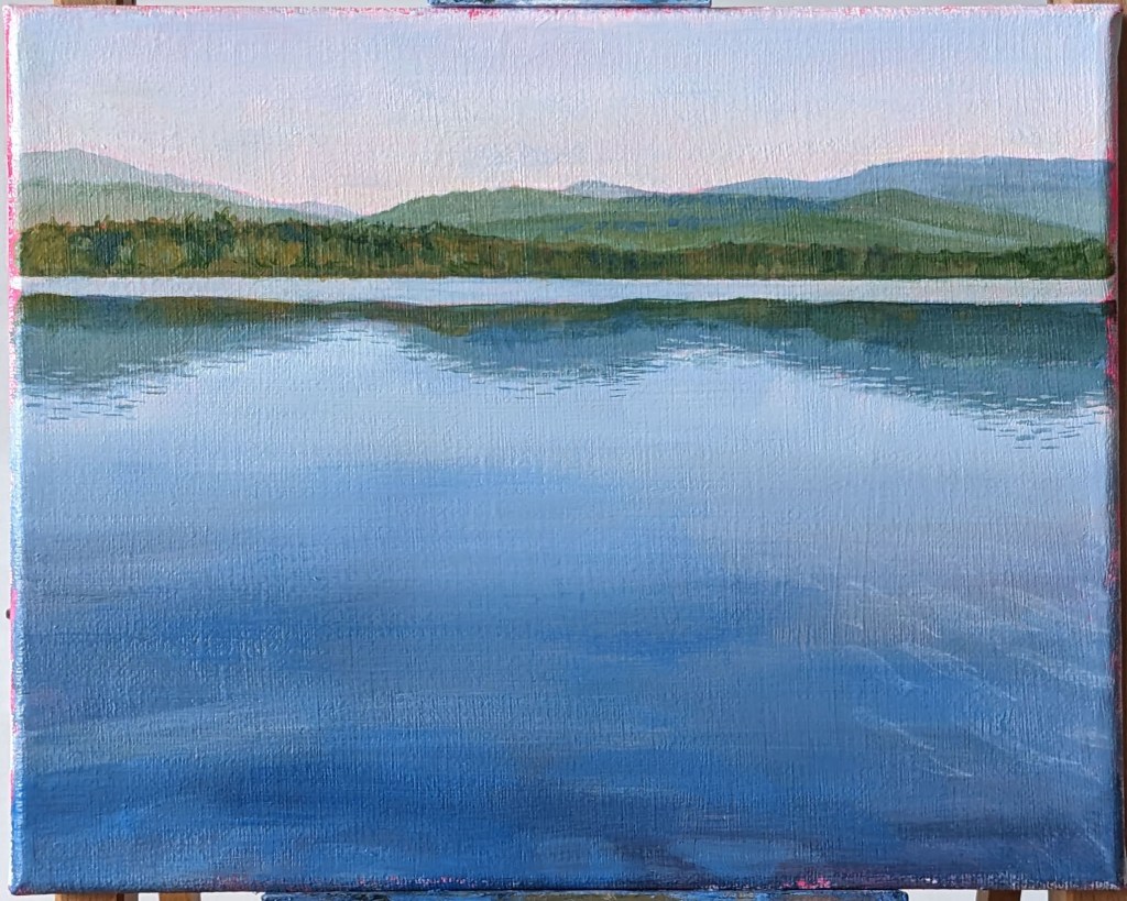
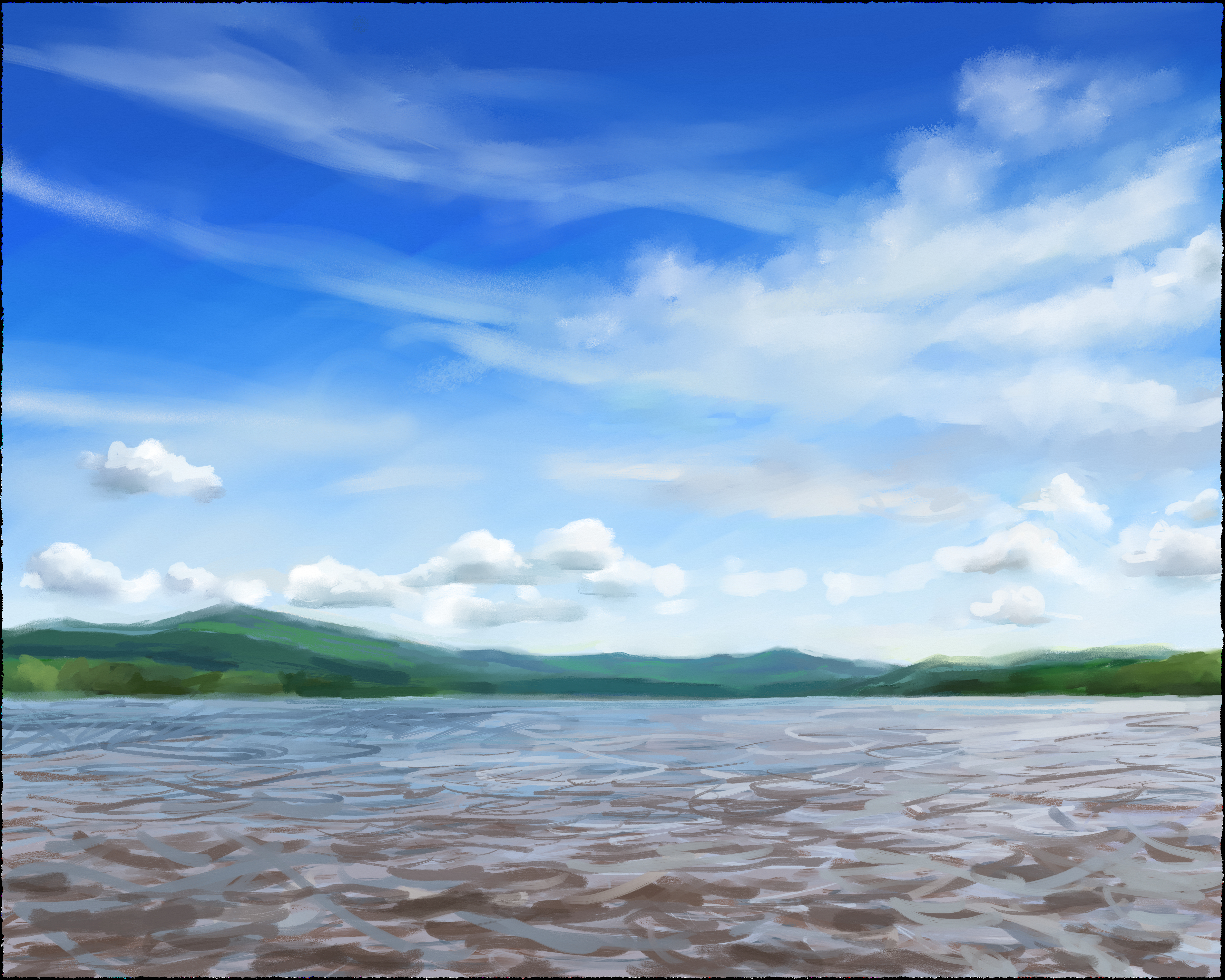
Being furloughed, I have more “quiet time” than is strictly necessary, but at least it gives me a chance to get some painting done! On the easel this time, yet another dreamy landscape (and yes, it’s Lac des Sables up at Mont Tremblant National Park, again – I got a whole theme going, and am thinking of asking for contracts with the Laurentians Tourism bureau at this point). 😉
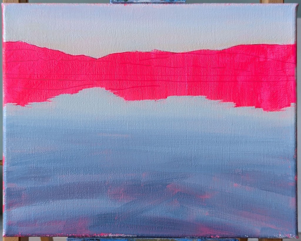
I started with a brilliant pink background because I thought that any pink showing through would look nice and fit the mood of the painting. Also, I just needed cheering up!
I was about 3/4 of the way through before I realized that the line of trees at the edge of the water could afford to be paled down in order to enhance the sense of space. I also felt that the general colour of the water needed some tweaking. After that, there was no more avoiding the ripples in the foreground – a favourite, as always (she said, gritting her teeth)!
The line of trees is too dark and it shortens the space. Still to do: the ripples!
It might interest you to know that there was an earlier version of this same painting, but I had started it with an orange background instead.
My husband liked the painting in its early stages so much that he convinced me to leave it as is. This rough, half-painted version now has a permanent home in his office!
So… do we like this version better? Is this how I should be painting ALL of my landscapes from this point onwards?
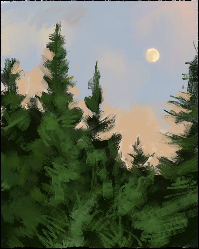
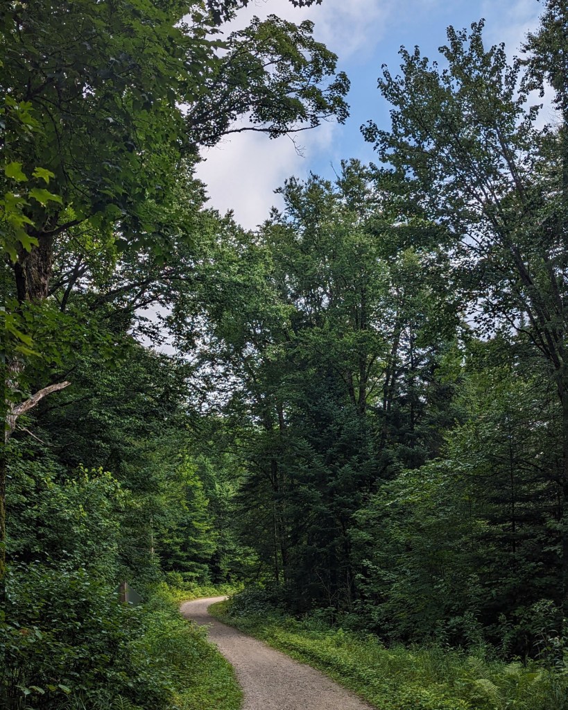
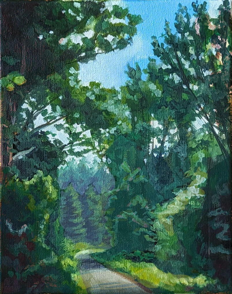
With all my paintings of lakes in recent days, I’m feeling a little waterlogged, so I thought I’d expand my painting horizons and try to paint a forest scene (“branching out” as it were). As a reference, I used one of my photos of the path that links Lac Monroe to the Chutes du Diable up at Mont Tremblant National Park
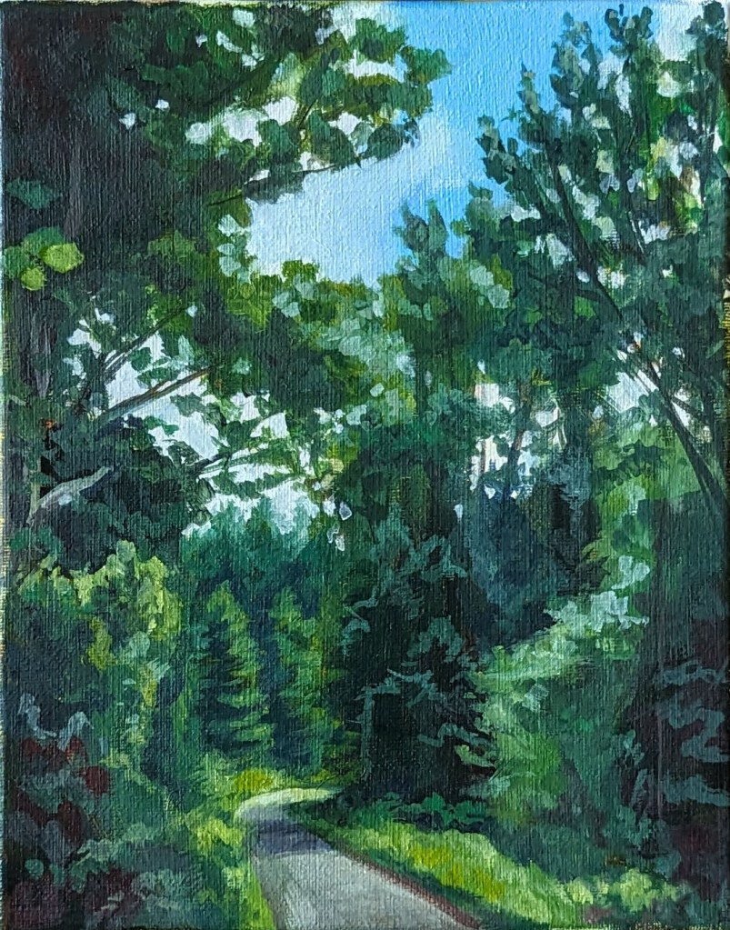
Far from being a “walk in the park” (sorry – had to!), this painting went through a LOT of reconstructive surgery. Stepping back to take in my finished piece, it became obvious to me that I had hewn too closely to my photo reference. The end result was a painting with values that worked against me, making the trees off in the distance appear to be on the same level as the trees that were in the foreground.
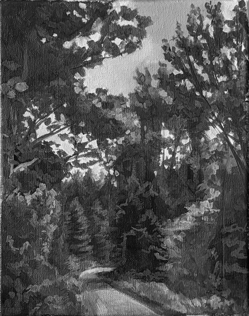
To test this theory, I brought my painting into Photoshop and used Image > Adjustments to switch it to Black & White. The results are below:
1st version of the paintingSame painting converted to black and white
Notice how the space feels very shallow, with an awkward push and pull between the foreground and background elements? Clearly, this needed a serious overhaul!
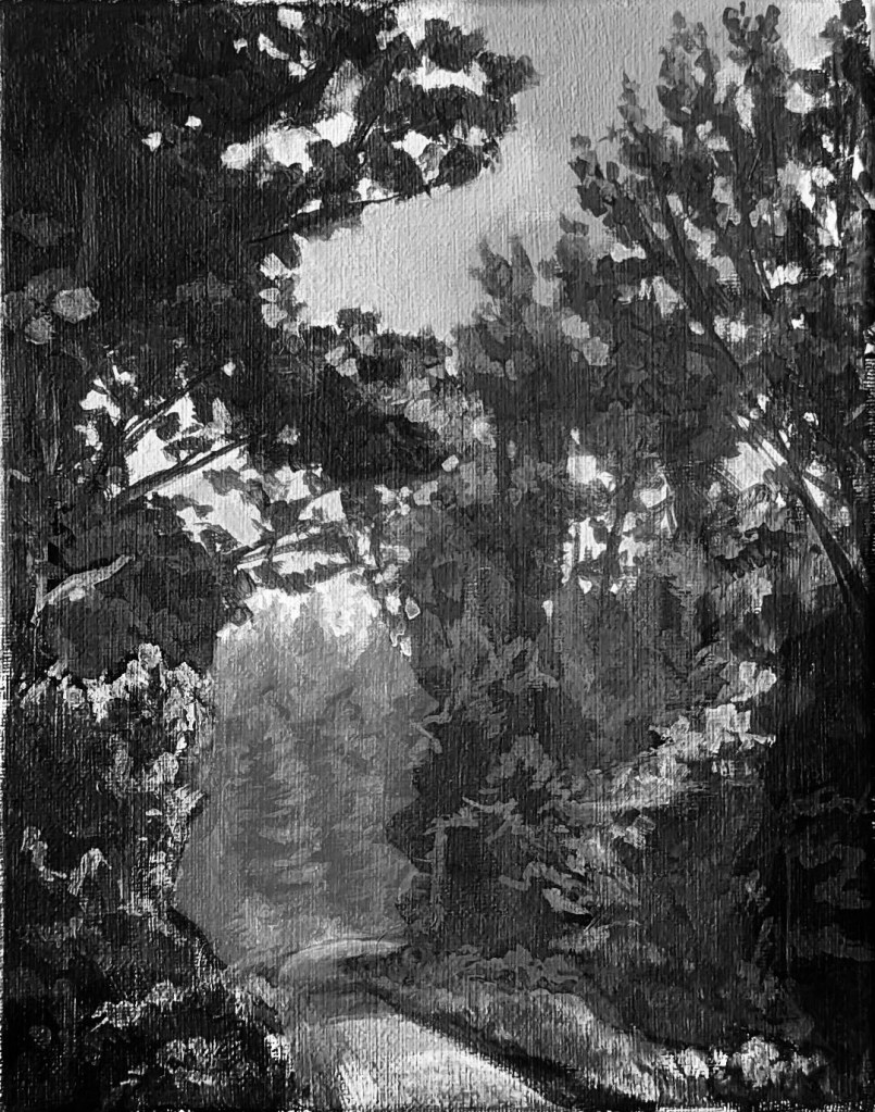
The first thing I did was tinker with the black and white version of my painting until the values held together in a way that made sense and created a feelinge of depth.
Old values = shallow picture planeNew values = now we’re going somewhere!
The next step was to adjust the coloured version of the painting in Photoshop so that when converted to black and white, the colours translated to the new values (or at least, resembled them as close as possible).
1st version of the paintingSame painting but with adjusted colours in Photoshop
Once I know what I was aiming for, I repainted the areas that needed repainting. Sometimes, I could get away with a light glaze, but other times, a complete repainting of certain areas was required.
Not gonna lie – this exercise in tinkering with values took much longer and was far more difficult than I had imagined it would be. I took countless progress photos and brought them into Photoshop so that I could compare the values, and not matter what, I always seemed to be slightly off the mark. Worse yet, the original brush marks in the first version of the painting disappeared the more adjustments I made, and I found myself missing that original, imperfect painting.
1st version……. to Photoshop adjustments…… to Final version!
In fact, I’m not completed convinced that this painting is well and truly done as I’m sure that certain areas could use some improvement (in other words, I’m not “out of the woods yet!” – okay, that’s the last pun, I promise!!). But for now, I’m happy to move on to other things!
This is actually the first landscape painting that I started a few weeks ago, but I panicked at the idea of painting all those ripples in the water, so I ended up finishing the Sunset painting earlier.
I have no clear motivation behind these landscape paintings other than treating them as opportunities to get back into painting again. I’ve spent far too long “cheating” with digital painting, and it’s a bit of a shock to realize that perceiving and mixing the correct colour is much harder than I remember.
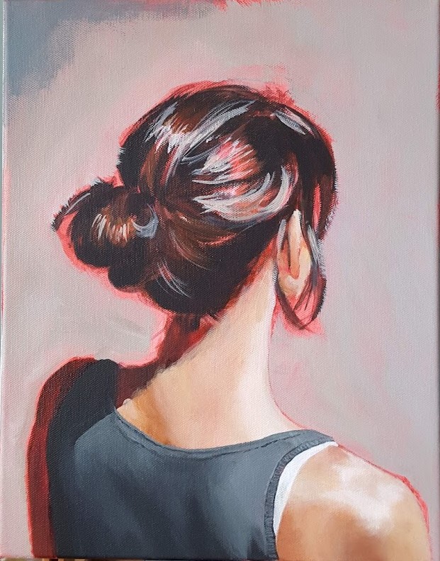
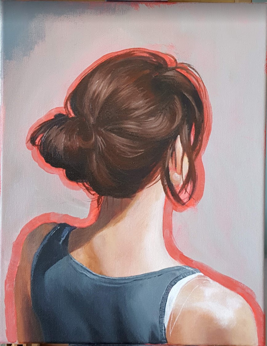
Here is another contender for the title of “Painting That Has Sat For The Longest Amount Of Time On My Easel While I Contemplate How Best To Approach It”. I believe it clocked in at about one full year. While I’m not completely sure why I lost my courage for so long, I suspect that I hesitated partly because I worried that the whole “portrait of the back of a woman’s head” thing had already been done to death. To me, it seemed like a cheap and easy way to add some mystery to an otherwise very pedestrian image. But artists steal ideas from each other all the time, and when you get right down to it, how many of us can say that our work is 100% original? We are all influenced by each other, and if you’re waiting for a truly original idea before putting paint to canvas, you’ll be waiting a long, long time. Life’s too short!
Original Reference Photo
I also wavered quite a bit on what medium to use. Acrylics are odor-free but difficult to blend, while oils (even water-miscible oils!) give me a headache. In the end, most of the painting is acrylic, with only the hair and certain details on the clothing are oils.
This piece also went through a few digital iterations prior to – and even during – the painting process. You might remember this earlier post where I played around with various background colours on a first pass of digital painting.
The winning background colour!
Once I’d decided on the background colour, I put down a first layer of acrylics then painted a second digital pass on top – just to reassure myself that I was going in the right direction after all.
1st pass of Acrylics2nd digital pass – Photoshop.
And finally, here are some more process shots as I moved from acrylics to oils.
And now this painting sits on my piano – which I also haven’t touched in forever, btw – where I can see it every day, and it fills me with a sense of enormous well-being, and also a healthy dose of “Took you long enough!”