As we approach the halfway point of 2016, I thought it would be cool to assemble all (or most of) the artwork I’ve produced so far this year and get a better sense of where I want to go next.
Continue readingAs we approach the halfway point of 2016, I thought it would be cool to assemble all (or most of) the artwork I’ve produced so far this year and get a better sense of where I want to go next.
Continue reading
Dear Universe,
I’m too old to believe in Santa Claus, but I’m also practically-minded enough that I’ll try just about anything if I’m desperate.
So in the spirit of The Secret, or the Law of Attraction, or even “If you build it, he will come”, I’ve put together this handy-dandy Advance Christmas Wish List for myself that the Universe can peruse at its leisure. Please note that every item has been carefully chosen to help me build, and solidify, my art practice.
More time during the day to get more work done. Failing that, an extra 10 months or so of winter would be an acceptable substitute as long as I can get more paintings out the door before my daughter finishes the school year and I have to spend the subsequent 9 weeks keeping her entertained until the beginning of the next school year. I understand that this might not be agreeable to everyone, but if they are so inclined, they can write their own wish lists.
In order to avoid discovering NEW ships to fangirl over, do NOT let me see any movies for the next few years. (No, I am STILL not over Star Wars: The Force Awakens, and NO, I still haven’t forgiven you)
Have all of my current favourite television programs turn to complete crap for an indefinite amount of time so that I am no longer driven to distraction by the latest episode of Game of Thrones, etc. and my “fave, problematic ships” and “otps” contained therein.
A way to remove my fears and doubts about my art (and my life!) from the sewage treatment center of my brain and convert them into something slightly less odious, such as scented bath crystals, or flavoured marshmallows. (Think about it, Universe! We could make a real killing, you and me…!)
Have a whole whack of young, cool, pretty people suddenly become my friend and be like “Oh yeah, sure, I’ll TOTALLY pose for your next painting. Thank you for asking me!”. If that’s too creepy (and yes, it sounds awfully creepy), then please forward me the money to pay said young, cool, pretty people to pose for me. I would use myself as a model, but alas, I am no longer young, and while I used to be pretty, I have never, ever been cool…
Ditto for makeup artists, hairstylists, and vintage clothing collectors.
Disabuse me of the notion that I can make do with less. If the work I want to create requires x, y, and z, then by golly, grant me the hutzpah to go out there and get it (or at least start asking around for help…very nicely).
That about sums it up, Universe. I await your Order Confirmation e-mail with baited breath.
Sincerely,
Emma
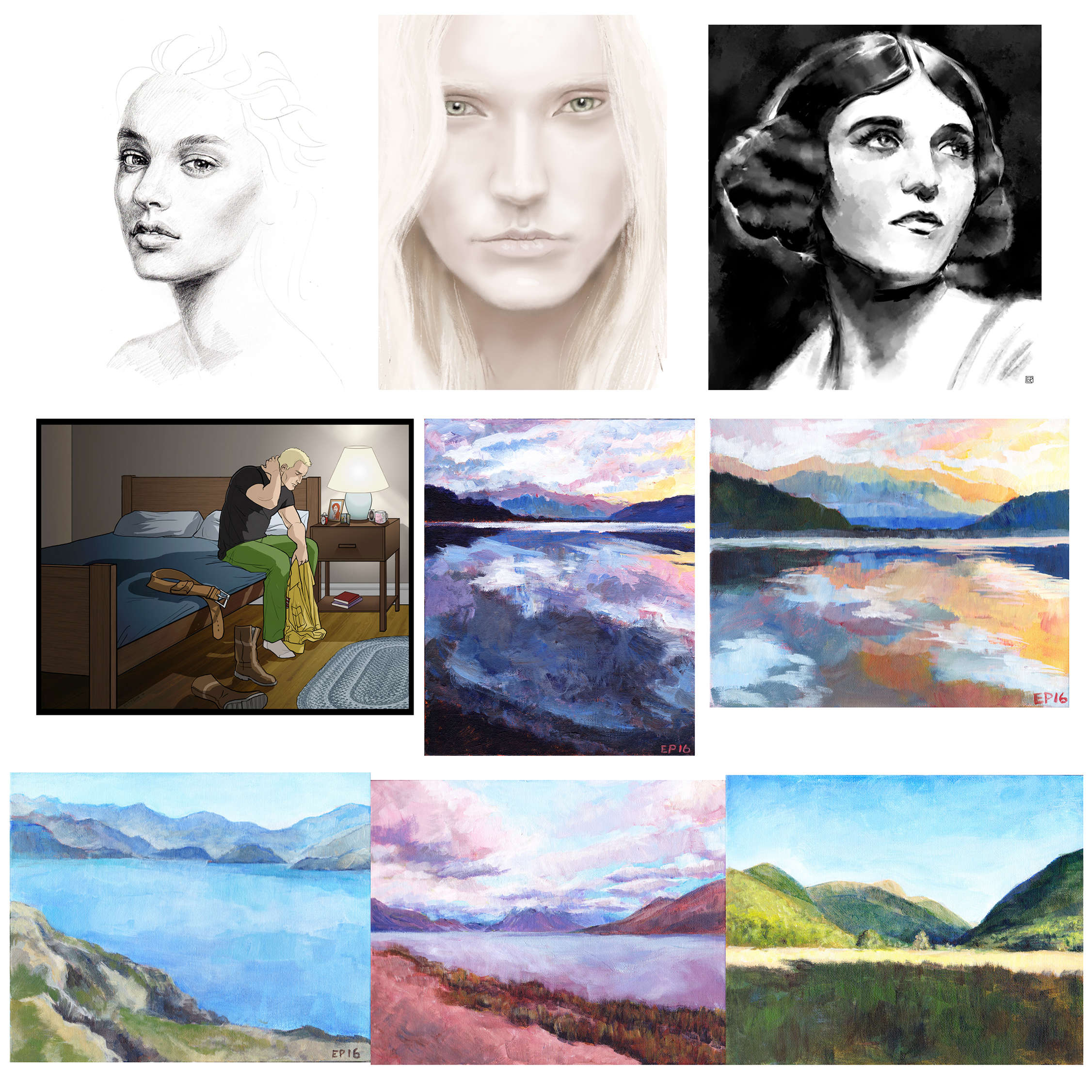
Back in January, I started listening to a lot of art-related podcasts while I set up my studio. One of the subjects that kept coming up was the value of daily painting. The idea is that by painting small canvasses every day (or nearly every day), you could not only increase your productivity (obviously), but also give a serious boost to your skills. That sounded like a win-win situation to me, so one week in February, I armed myself with a bunch of 8″ x 10″ panels and went to town (or rather, to work). Behold the results:

I always knew that I wanted to focus on the figure in my artwork, but seeing as I didn’t have a posse of models at my disposal, I decided to try landscapes instead. I suppose I could have simply painted images from fashion magazines, but I kinda have a problem with straight reproductions. If you didn’t have an actual hand in composing the original image, I think that merely copying it is a bit of a rip-off (unless you specify that it’s just a study).
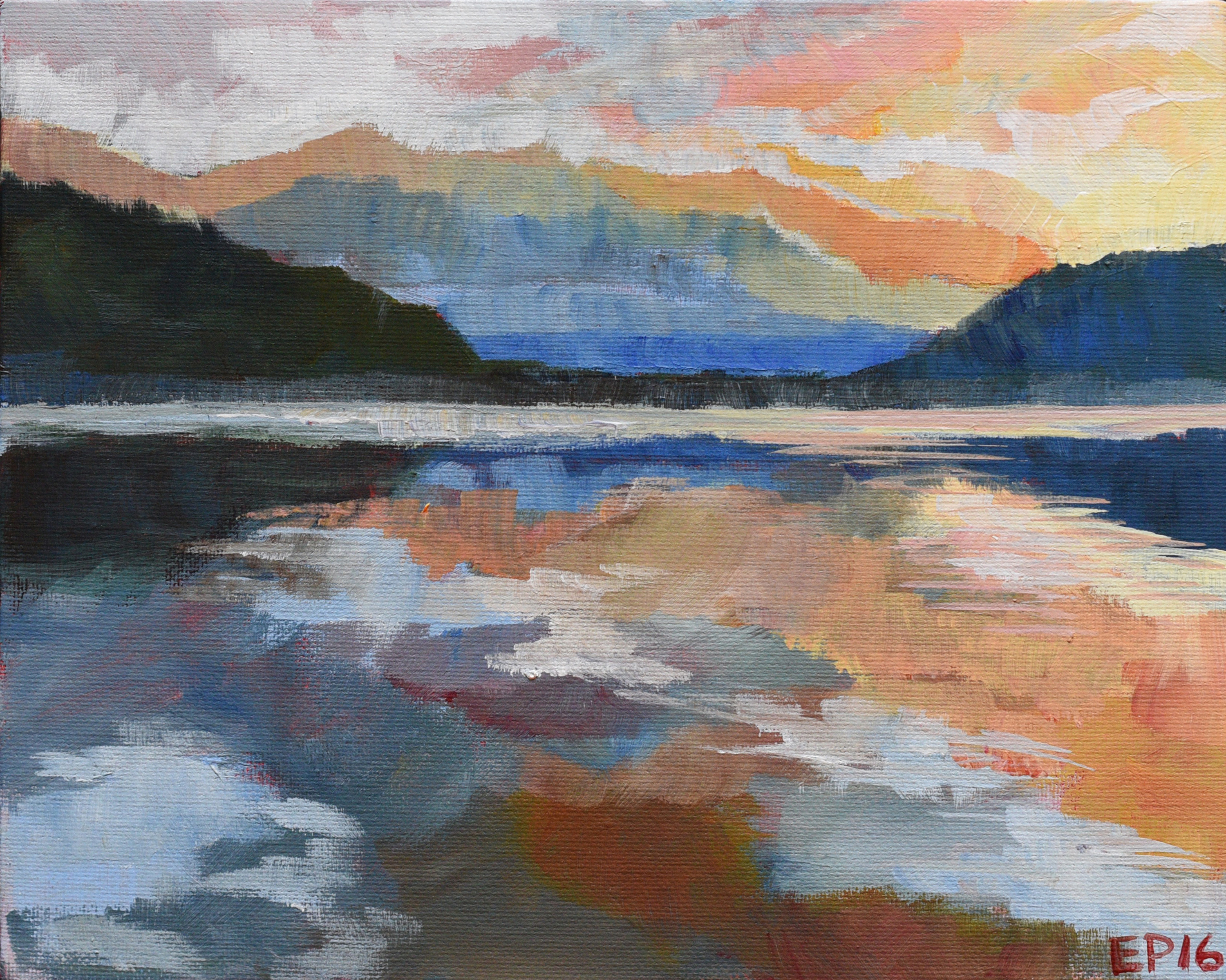

All of these paintings were done from my own photos of our Best. Trip. EVER – a 2-week Xmas camping vacation through the South Island of New Zealand about 10 years ago. We were living in Wellington at the time and decided to stay in the Antipodes over Xmas instead of hemorrhaging money on a trip back to Canada (my family’s in Montreal, his is in St. John’s, so, yeah… complicated).

So what did I learn from this little experiment? A few things:
Have you ever experimented with daily painting? Did you love it or hate it? And most importantly: what did you learn from it?


My first Superheroine painting went rather well, despite the fact that I never had an actual model in front of me at any point in time (this is all coming up in a future post, btw – I’m a little out-of-sequence). The whole thing was cobbled together from images from vintage fashion magazines, the internet, etc. A Franken-picture, if you will. And because I wanted realistic shadows on the face, I used my own face as reference.
Continue reading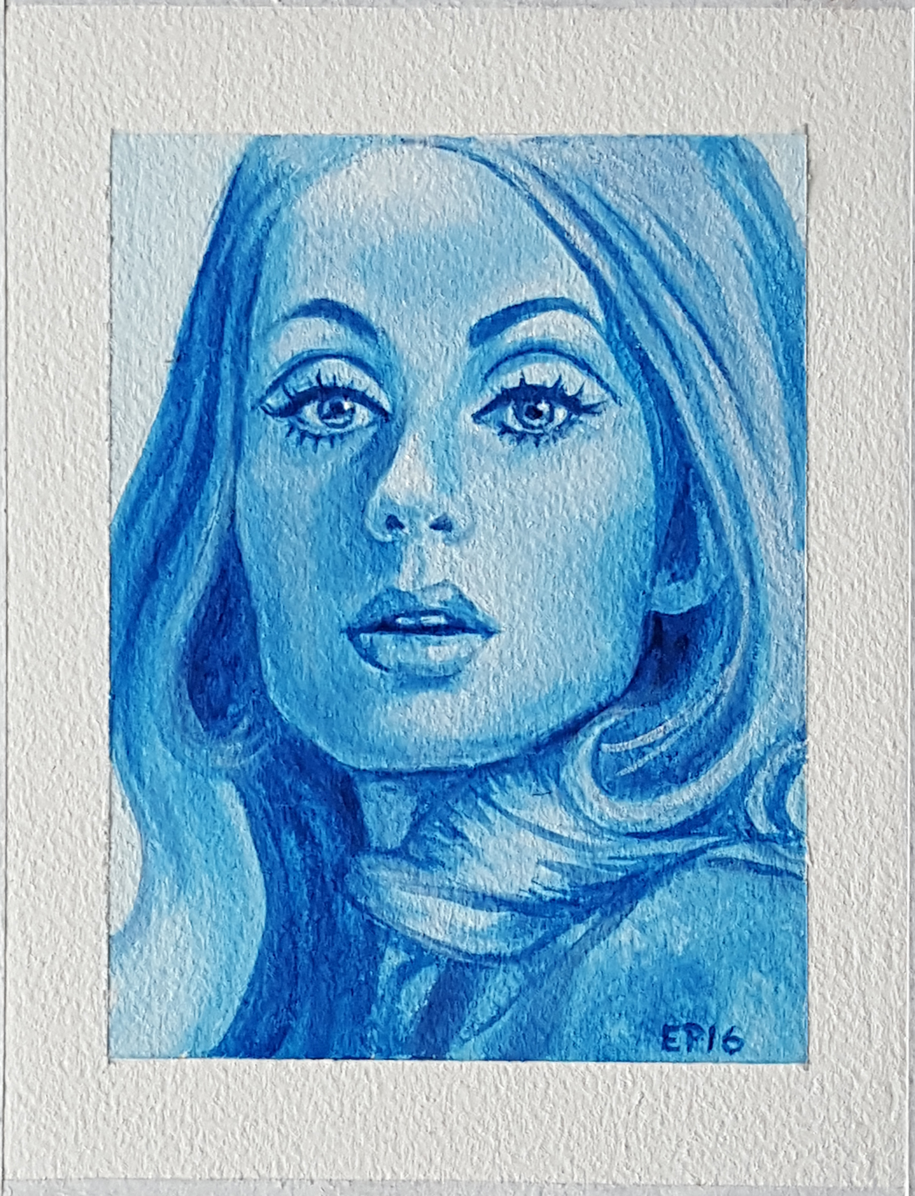
Every now and then, I like to get back to basics and do a proper study. Since most of the paintings that I have planned center on portraits of women wearing late 60’s – early 70’s clothing, an image from my copy of La Fileuse (a French knitting pattern catalog) from 1968 was a good place to start.
Being a sucker for punishment, I also decided to use only white and Phthalo Blue (“the priceless troublemaker”, as Carol Marine would say). Here’s what I learned from this particular experience:


