Undervaluing My Values

©2024, Emma Pittson, “Forest Path”. Oil on canvas, 10″ x 8″ x 0.5″.

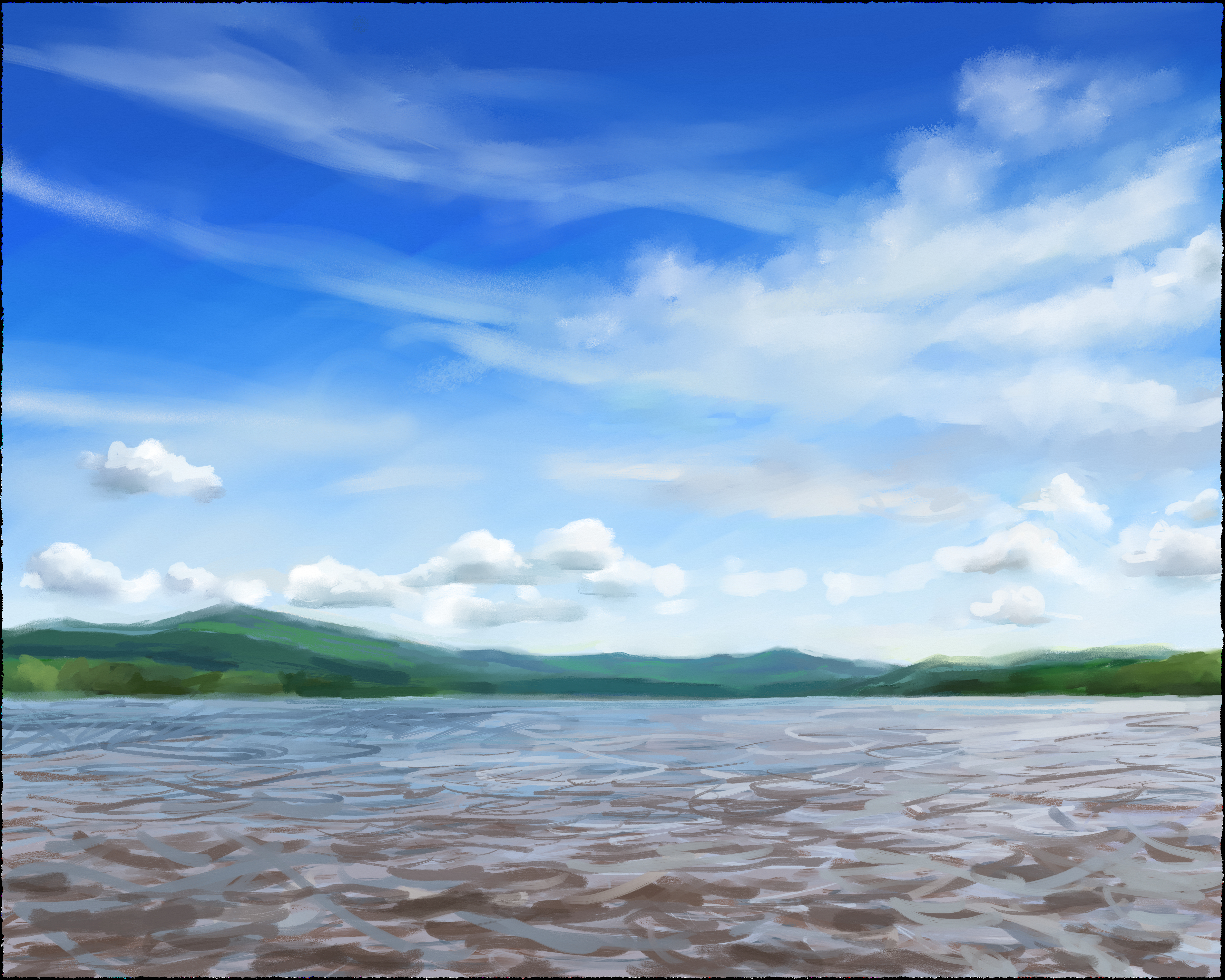
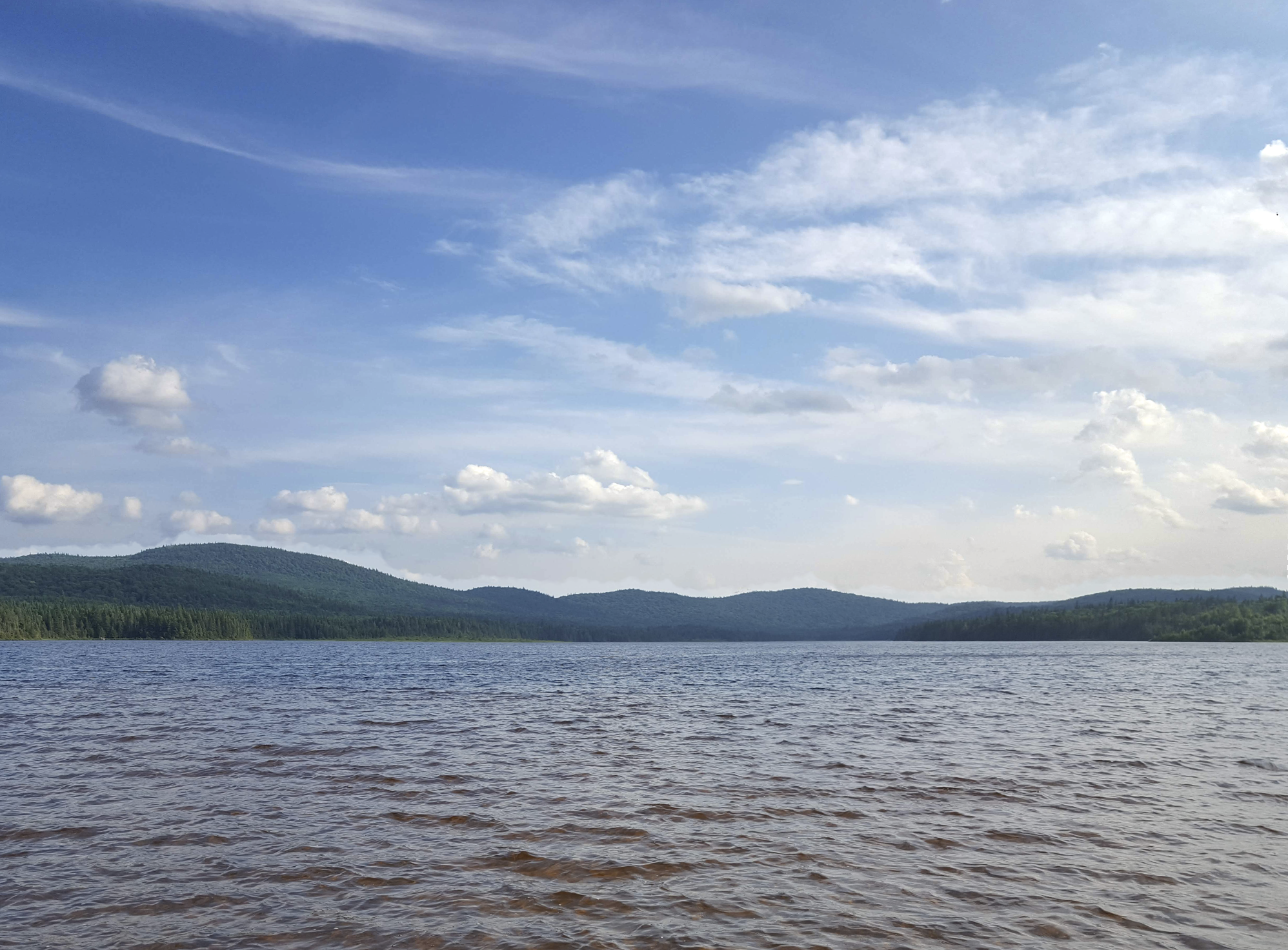
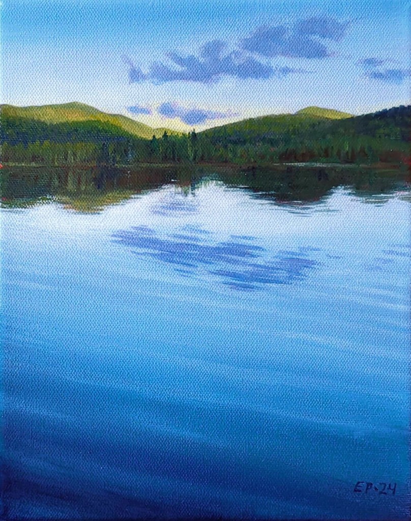
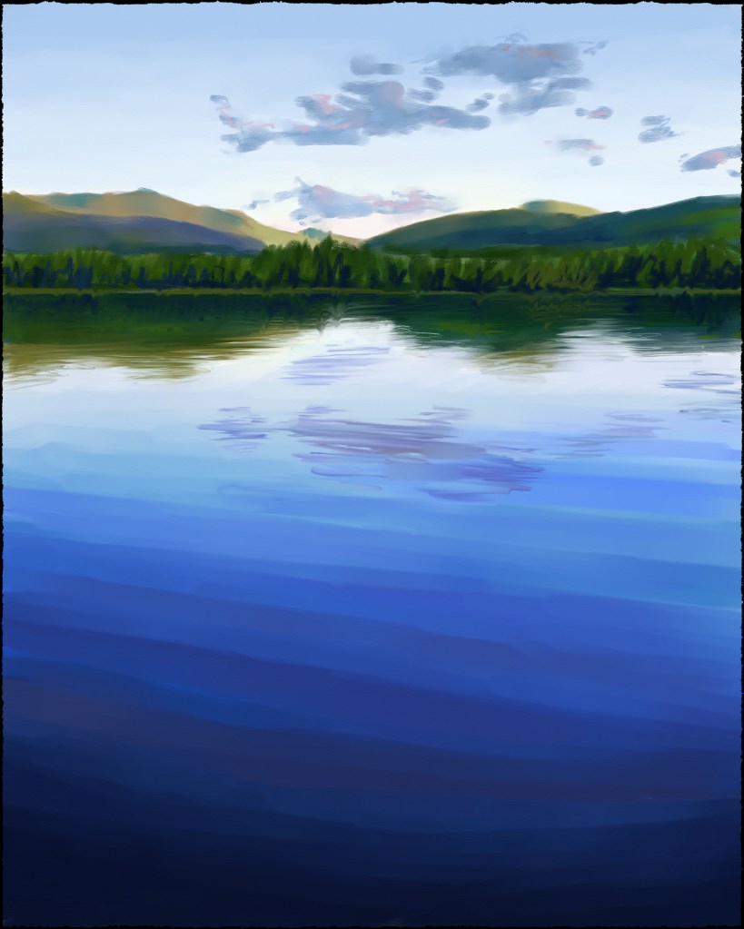
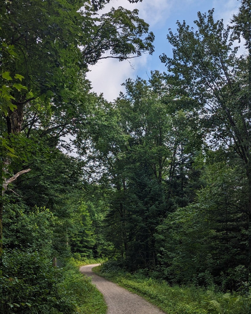
With all my paintings of lakes in recent days, I’m feeling a little waterlogged, so I thought I’d expand my painting horizons and try to paint a forest scene (“branching out” as it were). As a reference, I used one of my photos of the path that links Lac Monroe to the Chutes du Diable up at Mont Tremblant National Park

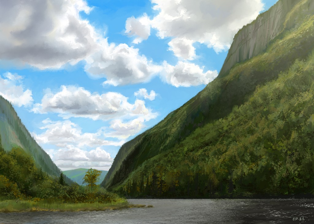
Far from being a “walk in the park” (sorry – had to!), this painting went through a LOT of reconstructive surgery. Stepping back to take in my finished piece, it became obvious to me that I had hewn too closely to my photo reference. The end result was a painting with values that worked against me, making the trees off in the distance appear to be on the same level as the trees that were in the foreground.

To test this theory, I brought my painting into Photoshop and used Image > Adjustments to switch it to Black & White. The results are below:

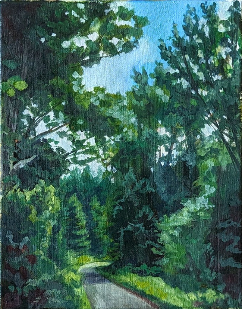
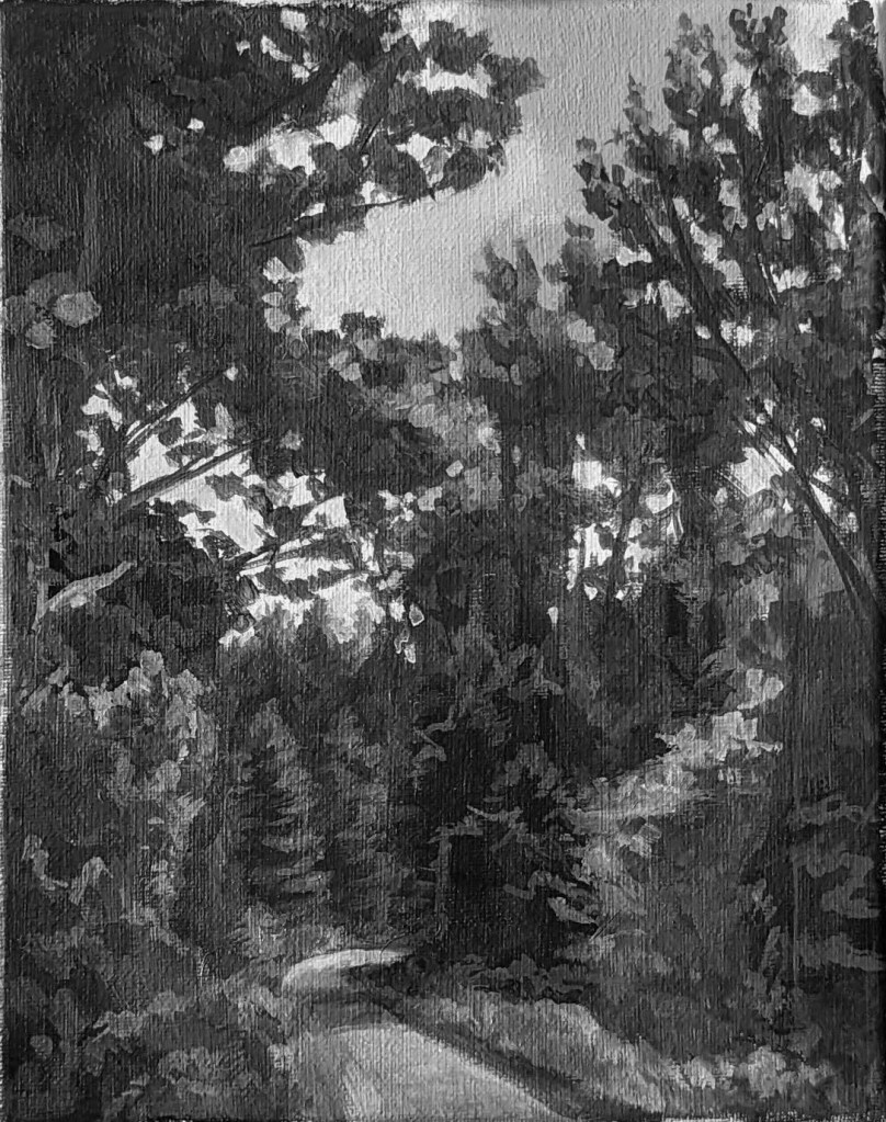
Notice how the space feels very shallow, with an awkward push and pull between the foreground and background elements? Clearly, this needed a serious overhaul!

The first thing I did was tinker with the black and white version of my painting until the values held together in a way that made sense and created a feelinge of depth.

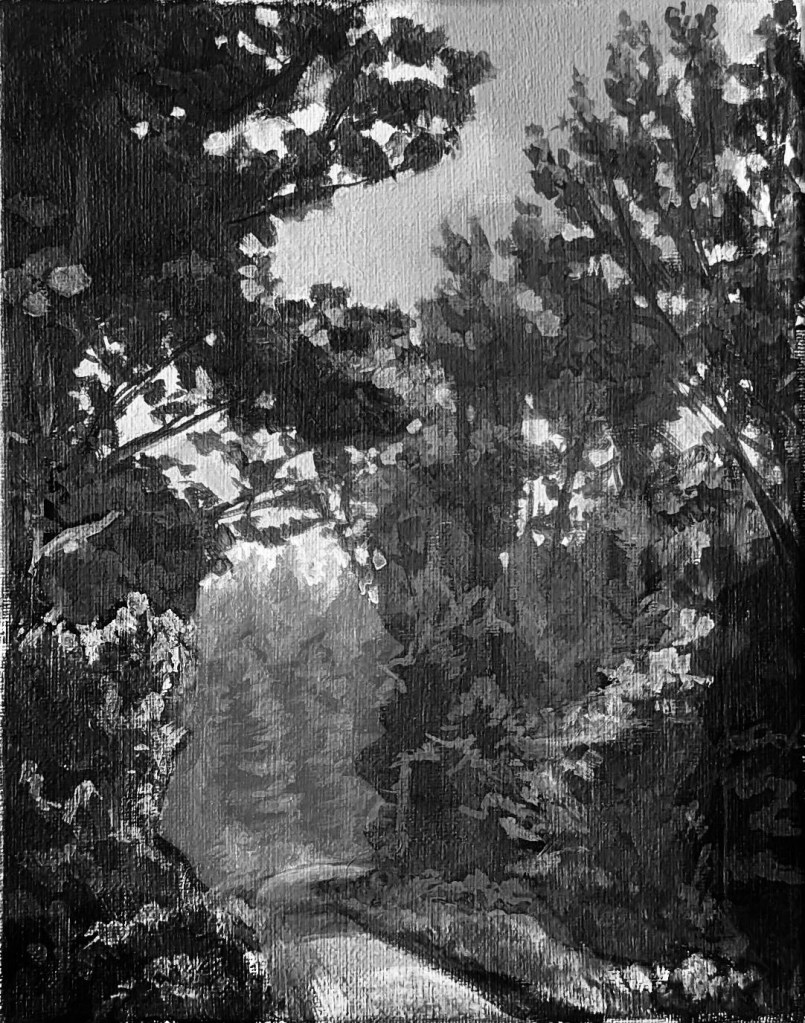
The next step was to adjust the coloured version of the painting in Photoshop so that when converted to black and white, the colours translated to the new values (or at least, resembled them as close as possible).

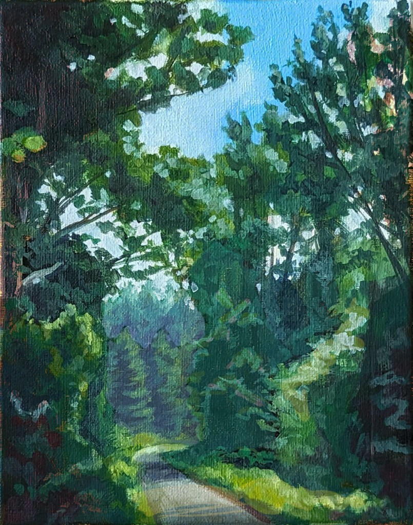
Once I know what I was aiming for, I repainted the areas that needed repainting. Sometimes, I could get away with a light glaze, but other times, a complete repainting of certain areas was required.

Not gonna lie – this exercise in tinkering with values took much longer and was far more difficult than I had imagined it would be. I took countless progress photos and brought them into Photoshop so that I could compare the values, and not matter what, I always seemed to be slightly off the mark. Worse yet, the original brush marks in the first version of the painting disappeared the more adjustments I made, and I found myself missing that original, imperfect painting.

In fact, I’m not completed convinced that this painting is well and truly done as I’m sure that certain areas could use some improvement (in other words, I’m not “out of the woods yet!” – okay, that’s the last pun, I promise!!). But for now, I’m happy to move on to other things!

Lac des Sables – Take 2

©2024, Emma Pittson, “Lac des Sables”. Oil on canvas, 8″ x 10″ x 0.5″

This is actually the first landscape painting that I started a few weeks ago, but I panicked at the idea of painting all those ripples in the water, so I ended up finishing the Sunset painting earlier.

I have no clear motivation behind these landscape paintings other than treating them as opportunities to get back into painting again. I’ve spent far too long “cheating” with digital painting, and it’s a bit of a shock to realize that perceiving and mixing the correct colour is much harder than I remember.

On to the next!

Lac des Sables at sunset

©2024, Emma Pittson, “Lac des Sables at Sunset”. Oil on canvas, 10″ x 8″ x 0.5″.

I’ll say one good thing about being unemployed: plenty of time for painting!

And because I’d love nothing better than to ignore my current woes and dream of happier days to come, I’m manifesting my future summer vacation by painting where exactly I’d like to be right about now (okay, well, maybe not right NOW now, because it is February, after all).

I can also assure you from personal experience that Holbein’s Duo Aqua oil paint (in Ultramarine Blue, no less!) CAN clean up, fully and completely, from your carpet. 

Tidying up

©2019, Emma Pittson, “La Malbaie”. Photoshop.

I hope you’re enjoying the new layout for my website because I sure am! I’m in a real Organizing-And-Take-Stock moment of my life. Some people relax by watching TV or reading a good book, but for me, nothing soothes my nerves as much as decluttering. Now, if only I could get my family onboard…

And while sorting through some old files, I found this old gem from 2019 that I’d never posted. I was done during a moment of downtime between projects at work, and was the inspiration for the lunchtime landscape studies that got progressively more involved and sophisticated. The Charlevoix region of Quebec has some pretty spectacular scenery and I’d love to go back and try my hand at Plein Air painting, but I think I’ll have to wait until the gas prices go down before I head out on another road trip.

“Hautes Gorges” Re-paint

©2022, Emma Pittson, “Hautes Gorges de la Riviere Malbaie II”. Photoshop.

Another day, another re-paint! While I try to summon the courage to break away from digital art and actually pick up a paintbrush, I’m indulging in re-painting some of my older digital landscapes. It’s not entirely fair for me to disparage my old work and say “Wow! Look how much I’ve learned” because those first landscapes were just supposed to be quick studies done over my lunch hour (like I don’t spend enough time staring at a screen, right?). But with time, those early studies have started to look pretty clunky, and, quite frankly, a little embarrassing. I’m not saying that I’m going to give my entire portfolio a do-over, but… maybe a few pieces here and there.

Here is the original artwork for comparison…

©2019, Emma Pittson, “Hautes Gorges de la Riviere Malbaie”. Photoshop.