I’m still deep in my “mental vacation” and enjoying painting these summer landscapes!
I’m endlessly fascinated by sunlight and shadows on hillsides. Not only do I love it when the skies are partially cloudy, thus creating clear and obvious areas of light and shadow on the ground, but I love it even more when the terrain is hilly and you get to imagine what is just beyond those hills. Makes me want to throw on a backpack and start trekking!

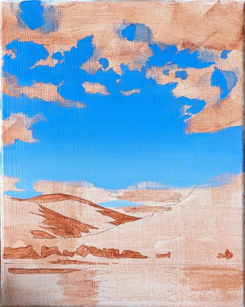
Unlike the previous landscape paintings, I did not opt for a brightly coloured ground this time around. My intention was for the acrylics to be their best acrylic selves and show off some bold colour, and I felt that fighting against a vivid ground would be overkill. Instead, I started with a light wash of Raw Sienna, and blocked in a few of the darkest areas of the painting.
The next step was painting in the blue of the sky all in one go. With any luck, I wouldn’t have to try to spot-paint any missing or botched areas along the way (because you can NEVER match the colour in a fade perfectly, no matter how hard you try). The clouds and water were then quickly blocked in.
As usual, beyond that, I got lost in endless noodling of the hillsides. I had hoped to keep the trees of the foreground hill fairly loose and undefined, but compared to the finesse of the farthest hill, the foreground hill looked out of place. In the end, I realized that it was best to paint in some individual trees (more or less), and I’m glad I did because that’s what really made that hill jump forward!
Other sneaky Photoshop trick: I was debating for a while if I should make the farthest hill paler. To find out, I uploaded an in-progress image of the painting into Photoshop and used the Magnetic Lasso tool to select only the farthest hill, and then adjusted the Brightness on it. As you can see, that little preview convinced me that paler was better!